

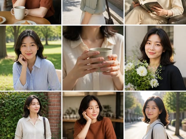













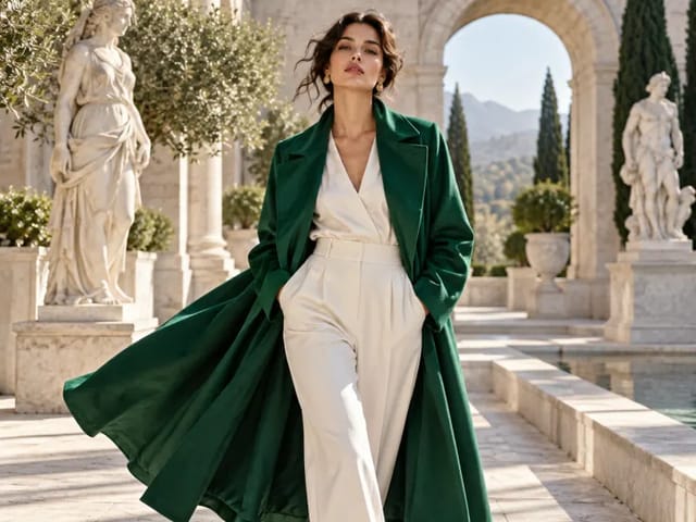

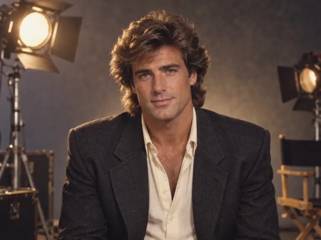
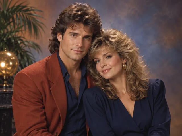
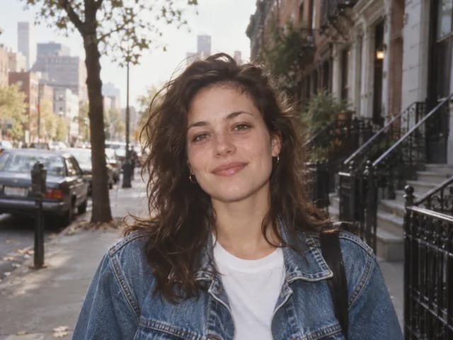
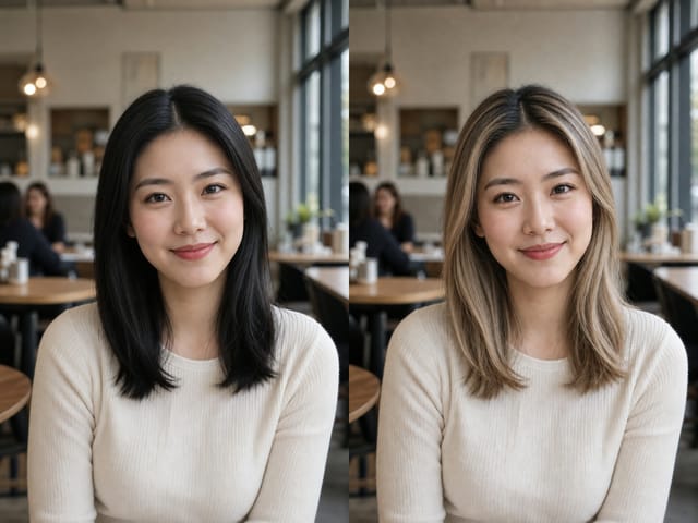
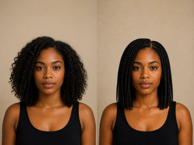
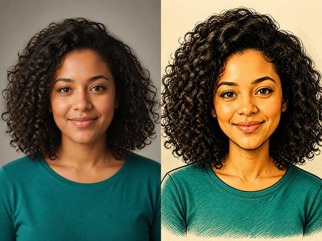
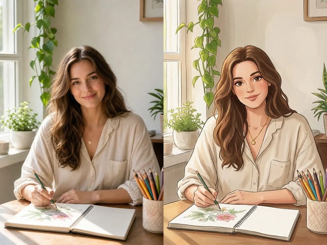
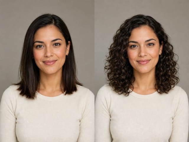


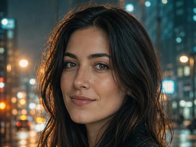
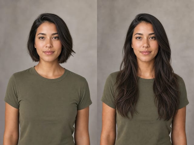






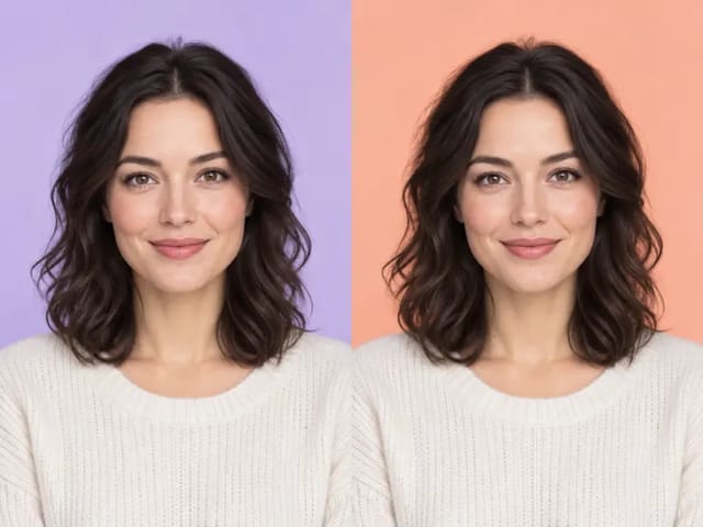
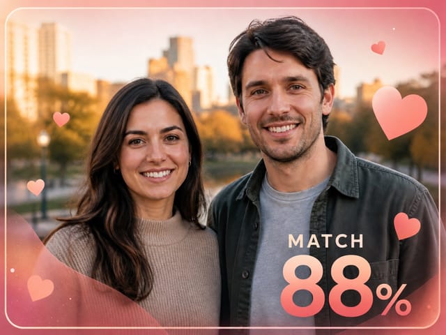


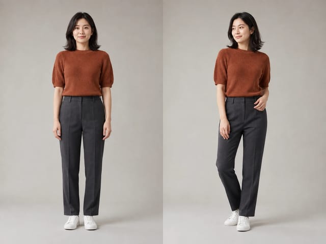

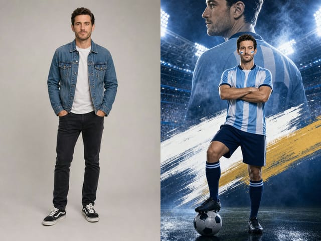
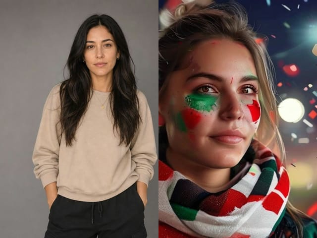
Warm film color on the same portrait
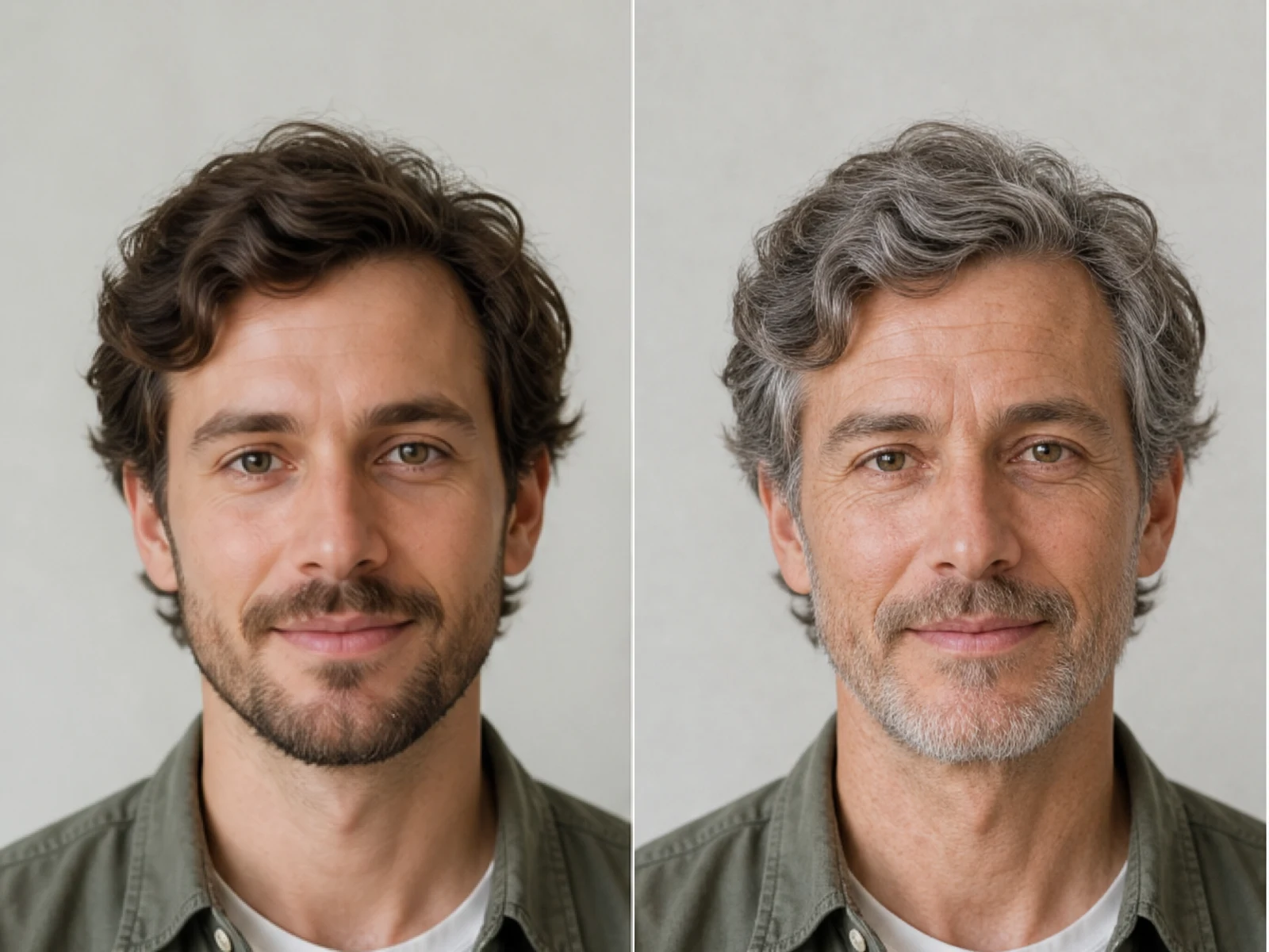
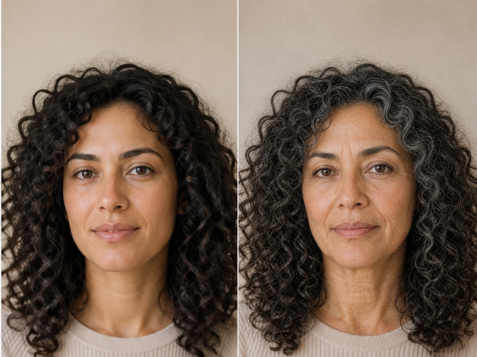
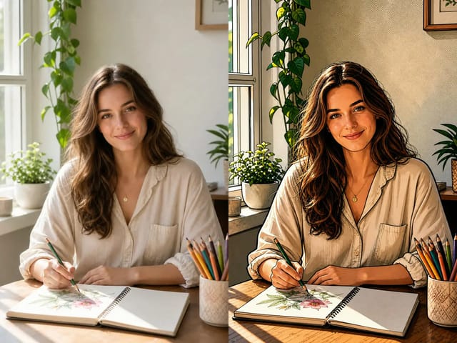
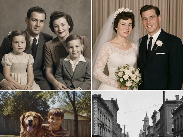
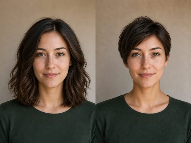
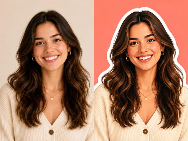
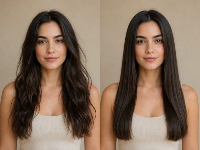
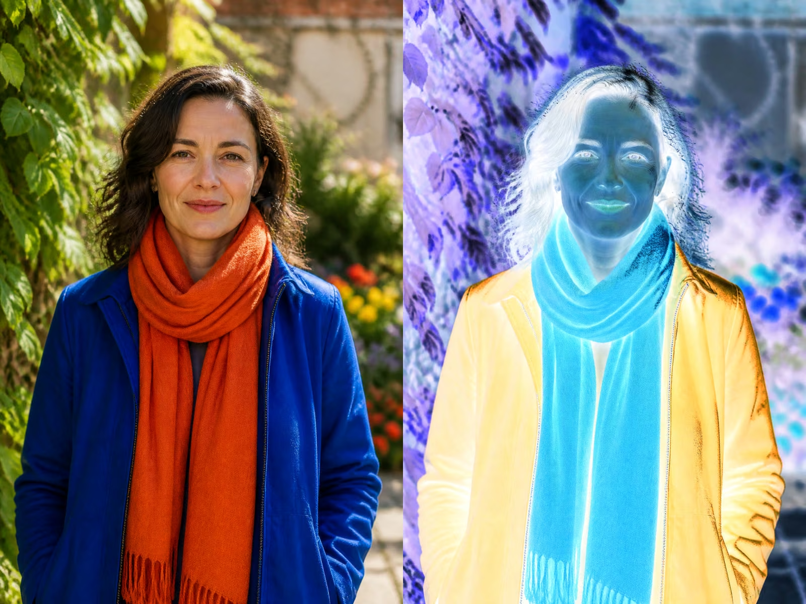
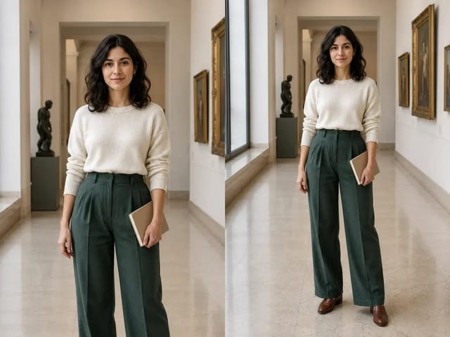
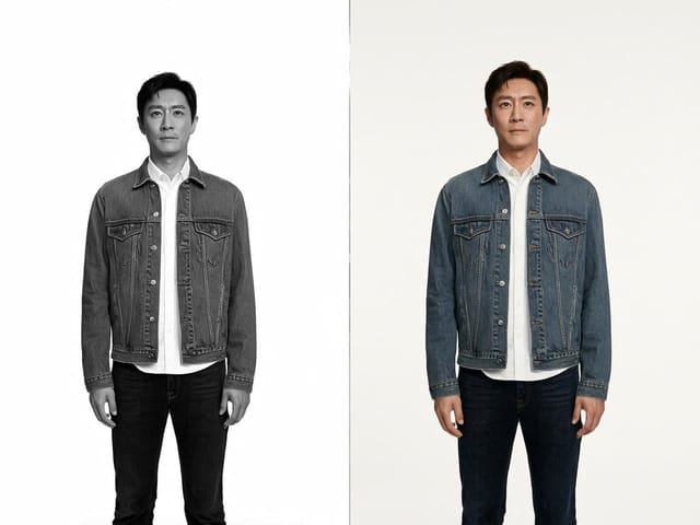
This is an actual export from the local browser filter. The pose and composition stay fixed while color and contrast change. It does not generate a new face or invent a different scene.

Save up to 73% on plans
Browse every other AI image model and effect published on this site in a continuous carousel.
This is an actual export from the local browser filter. The pose and composition stay fixed while color and contrast change. It does not generate a new face or invent a different scene.
This 80s photo filter changes the color treatment of your existing picture. It keeps the same scene, clothing, pose, and pixel dimensions while adding a warm, gently faded print-like appearance. Choose a file, set the strength, and apply the effect above.
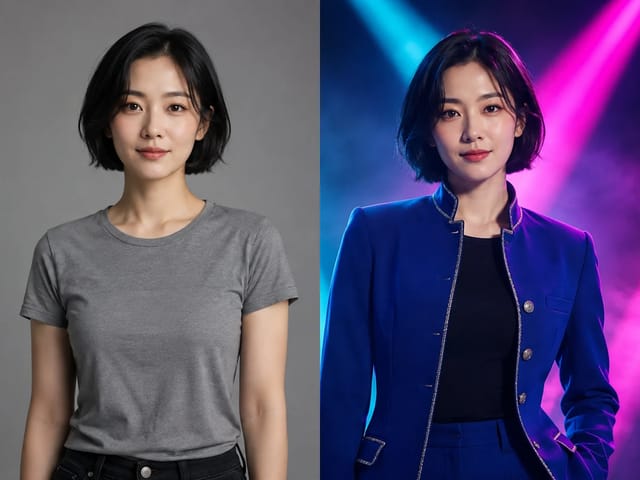
The workflow adjusts existing pixels; it does not replace a shirt, grow teased hair, move the subject into a vintage room, or invent a different decade around them. That distinction matters when a familiar face or exact composition should remain recognizable. If your brief requires a generative costume transformation, use a suitable editing workflow and review its result separately. Here, the creative choice is how much vintage color to apply to the photograph you already have.
The treatment introduces a warmer balance, a restrained reduction in color intensity, and lifted dark tones that suggest a faded print. It is a designed digital interpretation rather than an exact simulation of a named film stock, camera, or processing lab. The result depends on the input: a neutral daylight image and a neon night scene will respond differently. Start with a moderate setting and compare the subject before deciding whether to push the effect further.
Select a static JPG, PNG, or WebP image up to 20 MB, choose the effect strength, and apply it. The resulting PNG is available through the download control. The tool operates in your browser and does not upload the selected image to an image-generation service. Keep the original on your device so you can return to its starting colors later. Closing the page removes access to the temporary preview, so download a result you want to keep.
The source image contributes more to the final mood than a maximum-strength filter. Good framing, usable exposure, and a clear subject make a restrained treatment feel deliberate.
For a portrait, choose an image with reasonable exposure and a complexion you can still judge. Strong colored lighting can become more pronounced after a warm treatment, while badly clipped highlights contain no recoverable texture. Compare cheeks, forehead, and hands as well as the overall mood. A pleasant background does not compensate for unnatural skin. Lower the strength when warmth overwhelms the person, and keep visible age, expression, and natural facial texture as they appear in the source.
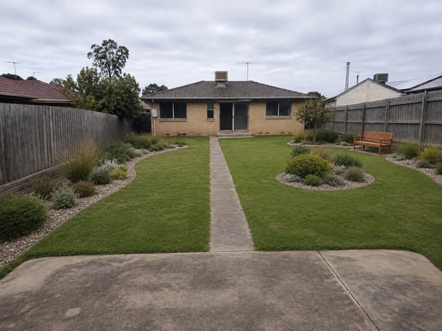
A park portrait, a kitchen table, a travel snapshot, or a simple still life can carry a nostalgic palette without elaborate props. Existing colors determine whether the result feels muted, warm, or slightly unexpected. Try a scene with several distinguishable tones so you can compare how each changes. The filter will not remove a modern phone or logo from the photograph. If those details conflict with your creative brief, choose a different source or edit them separately before applying this treatment.
Start from the earliest available file instead of a screenshot of a screenshot. Compression blocks and ringing around high-contrast edges remain part of the image after filtering. Changing the palette may make some artifacts less noticeable or more obvious, but it does not repair them. If your source is small, judge it at the size where you intend to publish. Enlarging a preview on screen is not evidence that the original contains more detail.
The strength control lets you blend between the original colors and the full designed treatment. Changing the control clears an outdated result so a download cannot silently represent a previous setting.
A moderate value gives you a useful first comparison without overwhelming the source. Apply the filter and inspect the original and result panels. Look at neutral areas, faces, foliage, and shadows rather than judging only a small thumbnail. If the scene already has a warm sunset palette, a lower setting may be enough. If it is visually flat, a stronger treatment may help establish a mood, but it will still not add lighting or objects that were absent.
Only the treatment strength varies here, which makes comparison simple. Move the slider, apply again, and compare the result with the source. Avoid evaluating one version on a bright phone screen and another on a dim laptop if color consistency matters. Screen brightness and ambient light can influence your impression. Keep the intended display context in mind and choose a setting that supports the image rather than making the effect itself the only thing a viewer notices.
At zero strength, the color transform contributes nothing to the decoded image pixels. The exported PNG is still a newly encoded file, not a byte-for-byte copy of your original. That difference includes file format and metadata. A zero-strength run is useful for checking the browser decode and export path, while your actual source file remains the best archival original. Do not overwrite that source when collecting several creative versions.
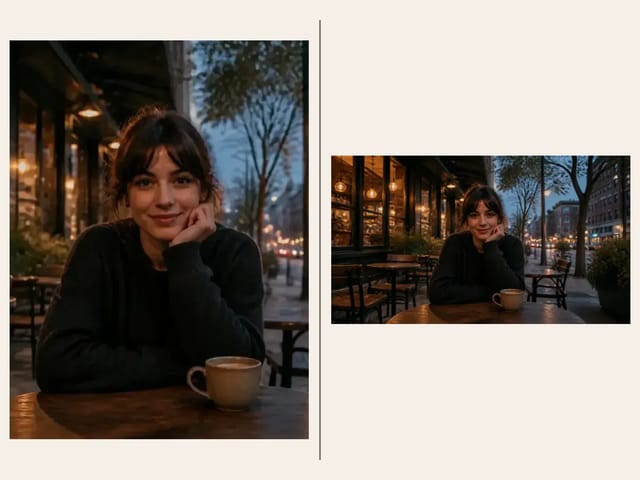
The preview preserves the whole image rather than forcing every photograph into a single crop. A tall portrait remains tall and a wide scene remains wide. This helps you judge the source and output without accidental framing changes.
Lifted shadows can make dark scenes feel softer, but they can also reduce separation between adjacent objects. Examine hair against a dark background and folds in clothing. In bright areas, look for a gentle transition rather than assuming a faded palette can rescue overexposure. The tool operates on the available values and cannot recreate clipped information. If the source already lacks detail, choose a gentler look or return to a better-exposed original.
Skin, white fabric, paper, grass, and food provide useful visual reference points. A creative filter can shift them intentionally, but the shift should suit the purpose. A nostalgic family snapshot permits different choices from an ecommerce listing that needs accurate product color. Do not use a stylized export as a color reference for a physical item. For comparisons, keep both panels visible and examine the same object rather than switching your attention between unrelated areas.
The filter does not crop or stretch the image. The output dimensions match the browser-decoded source dimensions, and the preview uses proportional sizing. Check the displayed dimensions after processing and inspect the downloaded file when exact delivery requirements matter. If the source includes an awkward crop, this tool preserves that crop; it cannot restore a missing head or extend the scene. Fix composition in an appropriate editor before applying the final color treatment.
A PNG is a convenient way to keep the processed result without adding another round of JPEG compression. It may be substantially larger than the input, especially for photographs with fine texture.
Download the result, then place it in the intended layout before approving the look. A small social thumbnail can tolerate a stronger palette than a full-screen portrait. If a platform recompresses the image, review the uploaded draft where possible. The filter does not create captions, layouts, film borders, or date stamps. Those elements can be added in another design tool, with enough care that they do not cover the subject or imply a false historical date.
Use the treatment to create a separate creative version of a contemporary photo. Keep filenames that distinguish the filtered file from the original. A vintage appearance does not establish when an image was taken, and it should not replace factual archive labels. If you are preparing a family album, keep the original date and context separately. This is particularly useful when old and new photographs appear in the same collection and viewers could confuse the treatment with genuine age.
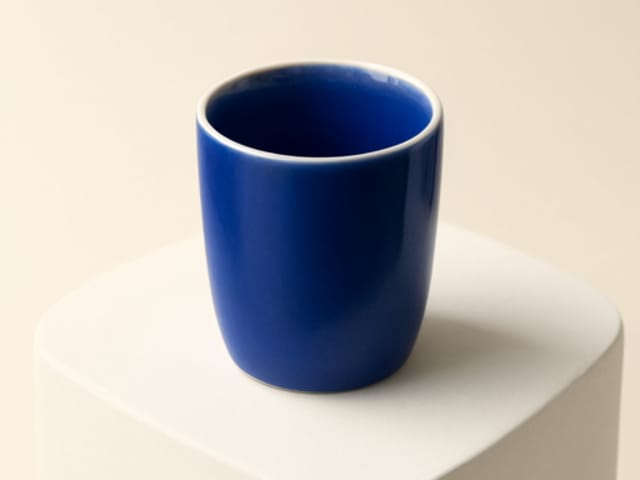
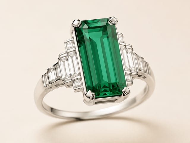
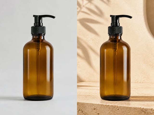
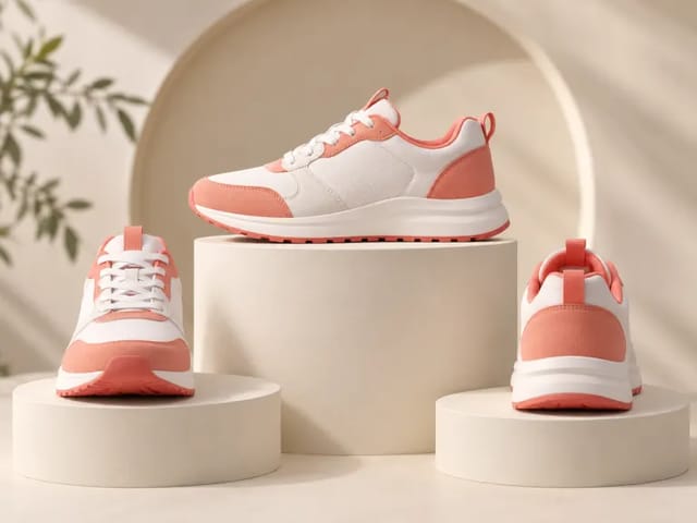
A still life can demonstrate a warm campaign direction without rebuilding the entire scene. Use the export for mood exploration, then check whether product colors still serve the brief. If exact color matching is required, keep an unfiltered product reference beside the creative version. The treatment applies across the image rather than selectively masking one object, so it is not a substitute for controlled retouching or a calibrated color workflow.
No. The tool applies a deterministic color treatment to the existing picture. It preserves the spatial content rather than generating new clothing, hair, props, or backgrounds. That makes it appropriate for film-inspired color, not a complete eighties costume transformation.
No. It is an original digital treatment with warm color and faded contrast. Real film appearance depends on stock, exposure, lighting, processing, scanning, and aging. Use the preview to decide whether this interpretation suits your image instead of expecting a match to a particular camera or archive.
The selected file is processed locally in this browser by this tool. It is not sent to an AI generation service. Download the PNG before closing or refreshing the page, because the preview and result are temporary browser objects rather than saved account history.
Its pixel width and height remain unchanged. The PNG file size can be larger than the source because it uses a different encoding. If you need larger pixel dimensions, use the separate resolution tool and remember that resampling does not recover missing detail.
The color transform leaves alpha values unchanged and exports PNG. A supported transparent source can therefore retain its transparency. Preview the downloaded file in the destination application to check how it composites against that application’s background.
This focused tool is for still JPG, PNG, and WebP images. Do not use an animated file expecting the whole animation to be filtered. Convert HEIC, RAW, TIFF, or other unsupported formats to a suitable still image in an appropriate application before using the tool.
To bound browser memory use, images must fit within 8,192 pixels on each side and 16 megapixels in total, as well as the file-size limit. Choose a smaller working copy. A phone with limited memory may still struggle near those limits, so reducing the source dimensions can help.
The download is a fresh canvas-generated PNG rather than a preserved copy of the source container. Do not rely on original EXIF, camera information, location tags, or editing history being retained. Keep your original file if that metadata matters.