AI Manga Colorizer
Sign In

AI Manga Colorizer

Upload original manga line art, edit your color brief, and generate. The model aims to preserve ink, panels, and dialogue, but cannot guarantee verbatim text.

Upload Manga Line Art*
Try Original Line Art

302 / 1,200

Copy Protection
Credits required:-
Public VisibilityAllow this result to appear in public inspiration surfaces.

Your Colored Manga Draft

Image

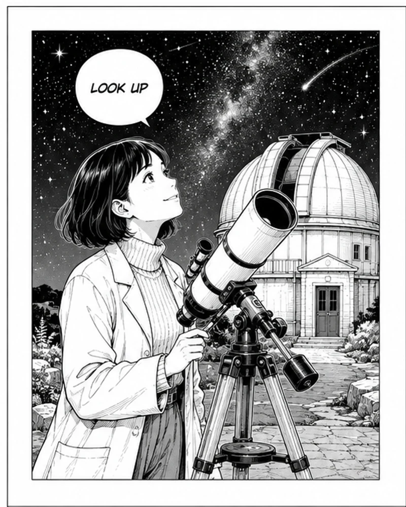
Fictional astronomer at an observatory line art
Line art
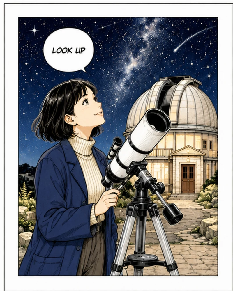
Fictional astronomer at an observatory color demonstration
Color study

Explore color for your own line art

AI Manga Colorizer helps you explore character, setting, and prop colors while keeping your original drawing as the reference for review. Use the image-to-image workflow for one manga page, experiment with warm and cool relationships, and refine your palette notes. The original AI illustration pairs are separately created demonstrations, illustrative color studies; your results will vary. Always compare your own result against the source.

How to colorize a manga page

Start with one clean source

Upload a manga page, individual comic panel, or original line drawing that you own or have permission to edit. A direct digital export is usually easier to work with than a photograph of a printed book. Keep the complete drawing inside the image, straighten tilted scans, and remove unrelated scanner borders before uploading. Start with a single representative panel when testing a new drawing style. This makes it easier to see whether the model follows your ink work before you commit to a complicated multi-panel page.

Write a small color brief

Name the recurring colors that matter: hair, jacket, skin, important props, and the background. Then describe the lighting and the amount of shading. A short, consistent brief is more useful than a list of conflicting art styles. The color instructions above are already filled in and remain editable. Replace the example palette with your own choices. Use the same descriptions across related pages, and change one variable at a time when comparing results.

Generate, compare, and keep the source

Sign in, review the current credit amount in the generator, and submit your uploaded artwork. Once the result appears, compare it against the original at a readable size. Check faces, hands, narrow ink strokes, panel borders, and every speech bubble before downloading. Keep the original alongside the color version so you can correct small errors in your drawing editor. A visually attractive result is a color draft until that comparison is complete.

Choose color without losing the drawing

Cel shading for readable characters

Clean cel shading uses defined color regions and a limited number of shadow steps. It is a useful starting direction for an expressive character panel because the viewer can still read the silhouette immediately. Ask for restrained saturation if the original depends on delicate line weight. Describe shadow placement using the existing light source instead of asking the model to invent dramatic lighting. Strong new highlights can make an otherwise faithful face look like a different drawing.

Soft washes for quiet scenes

A gentle watercolor direction can suit landscapes, botanical scenes, and reflective moments. Specify transparent washes, visible black outlines, and clean white gutters. Avoid demanding heavy paper texture when the source already contains dense screentones; those textures may compete. If pale faces or small objects lose definition, ask for slightly stronger local contrast while keeping the background quieter. The aim is to add atmosphere around the ink rather than bury its visual rhythm.

Limited palettes for a coherent chapter

Two or three dominant color families can help a sequence feel connected even when scenes change. For example, use slate blue for clothing, warm ochre for interior light, and muted green for plants. Repeat the exact palette notes for each page. This tool does not automatically remember a character sheet or lock colors across a chapter. Compare pages side by side and correct inconsistent hues manually when continuity matters.

Protect linework, panels, and dialogue

Ink remains the structural guide

The editing instruction prioritizes outlines, hatching, screentones, and the original composition. Nevertheless, this is a generative image edit, so a thin eyelash, tiny background object, or textured shadow may change. Examine high-contrast edges and areas where two objects overlap. If the result redraws too much, simplify your brief, request flat restrained color, and try a clearer source. Avoid simultaneously asking for new poses, costumes, camera angles, or a different drawing style.

Treat lettering as a separate review task

The model is asked to leave dialogue and white speech bubbles in place, but it cannot guarantee verbatim text preservation. Small characters, punctuation, sound effects, and vertical lettering are especially easy to overlook. Compare every line of text with your source rather than trusting a quick thumbnail preview. If exact wording is essential, preserve a separate lettering layer in your original editor and restore it after colorization. This page does not include automatic typesetting or text repair.

Give dense pages enough room

A full manga page places more information into the same output than a single panel. Tiny faces, narrow gutters, and many dialogue bubbles can become difficult to preserve. Test the complete page first only if its details are already legible. Otherwise work on larger individual panels, then assemble them in your editor using the original page as a layout guide. Check panel ordering and borders after assembly; the generator does not manage a multi-page document.

Four original sample directions

Observatory: cool night, warm face

The fictional astronomer sample offers a simple contrast between a cool exterior and warm local light. Start with a navy jacket, pale amber telescope reflections, and a quiet blue night. Keep the speech bubble white. It is a useful check for thin mechanical outlines and small lettering. The sample is original AI-created illustration material, not a scan from a published manga or a promise that every generation will match its demonstration colors.

Greenhouse: separate neighboring greens

The botanical illustrator scene gives you plants, glass, clothing, and a sketchbook within one composition. Give the foliage muted green, the clothing a contrasting earthy color, and the page neutral white. This tests whether adjacent objects remain distinguishable. Avoid making every surface equally vivid. A little color separation between the foreground leaves and the greenhouse structure often does more for readability than increasing saturation everywhere.

Lighthouse and bakery: different structures

The fictional bicycle robot provides a clean single-panel subject with sky, masonry, metal, and road surfaces. The bakery example uses two panels, a recurring character, and a speech bubble. Compare the single-panel scene with the denser page to understand the tradeoff in detail. These samples illustrate possible color directions; they are separately created demonstrations rather than a guarantee of pixel-identical line or lettering retention.

Useful workflows for your own artwork

Explore a comic color script

Use a representative panel from each scene to explore mood before coloring an entire story. Save the source, brief, and selected color draft together. Look for a coherent transition between daylight, interiors, and evening scenes. Treat generated drafts as discussion material for the artist or colorist. Once a palette is agreed, apply your established production workflow to maintain exact continuity, layered files, and final lettering.

Prepare a readable webtoon preview

Color can help distinguish clothing, background, and foreground when readers view a panel on a phone. Begin with an individual panel instead of uploading a very long scrolling episode. Use the closest available output shape and review the result at the size readers will actually see. Inspect faces and bubbles at full resolution too. Reassemble panels outside this tool; it does not export a complete scrolling episode or batch-process a chapter.

Practice palette decisions on original sketches

For personal drawing practice, compare a cool background against warm skin, or a limited palette against a broader one. Keep the line drawing fixed and change only your color note between attempts. Write down why one version reads better: clearer silhouette, quieter background, stronger focal point, or less competing contrast. AI output can suggest possibilities, while the final artistic decision remains yours. Use the included fictional samples if you do not have a suitable drawing ready.

A practical prompt recipe

Name subjects before atmosphere

Try: “Color the jacket slate blue, hair dark brown, skin warm beige, and plants muted olive. Keep the sketchbook and speech bubbles white. Use soft daylight and crisp flat shadows. Preserve the existing drawing, panel layout, and wording.” Replace those details with the actual subjects in your upload. Naming visible objects gives the request a concrete anchor and reduces the ambiguity of instructions such as “make it beautiful” or “professional manga colors.”

Resolve conflicting instructions

A request for transparent watercolor, glossy three-dimensional rendering, vintage print grain, and hard cel shading gives several competing directions. Choose one main treatment first. Keep preservation instructions stable and edit the color choices separately. If you want a different palette, change the jacket or background hue without also changing lighting and texture. That makes comparisons informative and helps you understand which instruction produced the improvement.

Finish with a publication check

After selecting a draft, inspect it beside the original and read every bubble aloud. Check repeated characters, missing props, new marks, and any changed panel edge. Open the downloaded media and confirm that its size and visible detail meet your needs. Keep your editable source file; the result is a flattened image, not a layered coloring project. Only share artwork when you have the permissions needed for the source and your intended use.

AI Manga Colorizer FAQ

What does an AI Manga Colorizer do?

It uses an uploaded manga drawing as a visual reference and generates a color interpretation guided by your editable instructions. It is intended for line art and comic panels, with special attention to ink, layout, and speech bubbles. It does not recover an artist’s original intended palette from a monochrome image.

Can I use it for free?

You can explore the page and sample directions without paying. Generation requires sign-in and uses credits; check the amount displayed in the generator before submitting. Available welcome credits depend on your account. Images made with free credits include the NanoPic watermark. The tool is not unlimited free generation.

Will every word remain exactly the same?

No. The prompt asks the model to preserve dialogue, but generative editing cannot guarantee verbatim text or pixel-identical linework. Review every speech bubble, caption, and sound effect. For exact publication lettering, keep and restore your original text layer in an editor.

Can I upload a full chapter or PDF?

This workflow handles one image at a time. Upload a supported image file using the limits shown by the upload control. Export an individual page from your own document first. There is no PDF import, folder batch processing, or automatic chapter assembly on this page.

How can I keep a recurring character consistent?

Repeat a concise palette specification for hair, skin, outfit, and recurring objects. Compare each result against your chosen reference outside the tool. Consistency is an instruction rather than a guaranteed lock. This page accepts one source image and does not offer a second color-reference upload.

Is this the same as photo colorization or photo-to-anime?

No. Photo colorization interprets realistic materials in a photograph, while photo-to-anime changes the visual style of a photo. This page starts with an existing comic drawing and focuses on adding color while retaining its structure. Use the related tools below if your source or goal is different.

Can I use my own commercial artwork?

Use drawings you created, own, or are authorized to modify, and confirm that your intended distribution is covered by those permissions. Colorization does not establish rights to someone else’s characters or pages. The fictional examples here avoid recognizable franchises and are provided as demonstration material.

What should I do if the colors bleed or details change?

Try a sharper source, simpler palette, and more restrained shading instructions. Work on a larger single panel if small details are crowded. Keep promising color regions and make final corrections in your editor when necessary. Each new generation can vary, so keep the source and compare rather than expecting deterministic output.

Continue your image workflow

Photo Colorizer

Explore natural colors for a black-and-white photograph.

Try Now

Photo to Line Drawing

Create a line drawing direction from an authorized photo.

Try Now

Photo to Anime

Restyle a photo as original anime-inspired art.

Try Now

Start with one manga panel

Upload clear line art, edit the color brief, and review the result carefully.