
Save up to 73% on plans
GPT Image 2.5 Image Generator
GPT Image 2.5 Flare

AI output preview
More AI Image Models & Effects
Browse every other AI image model and effect published on this site in a continuous carousel.
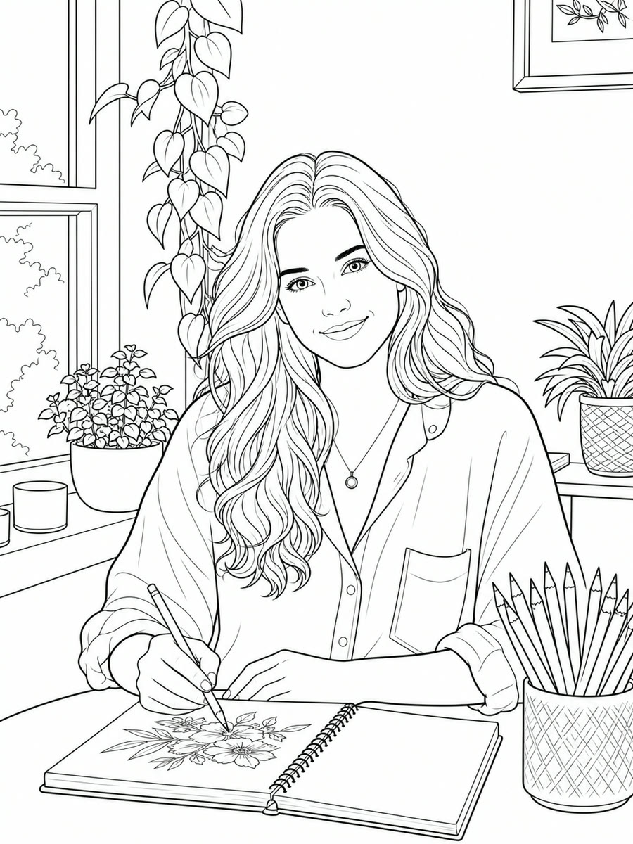
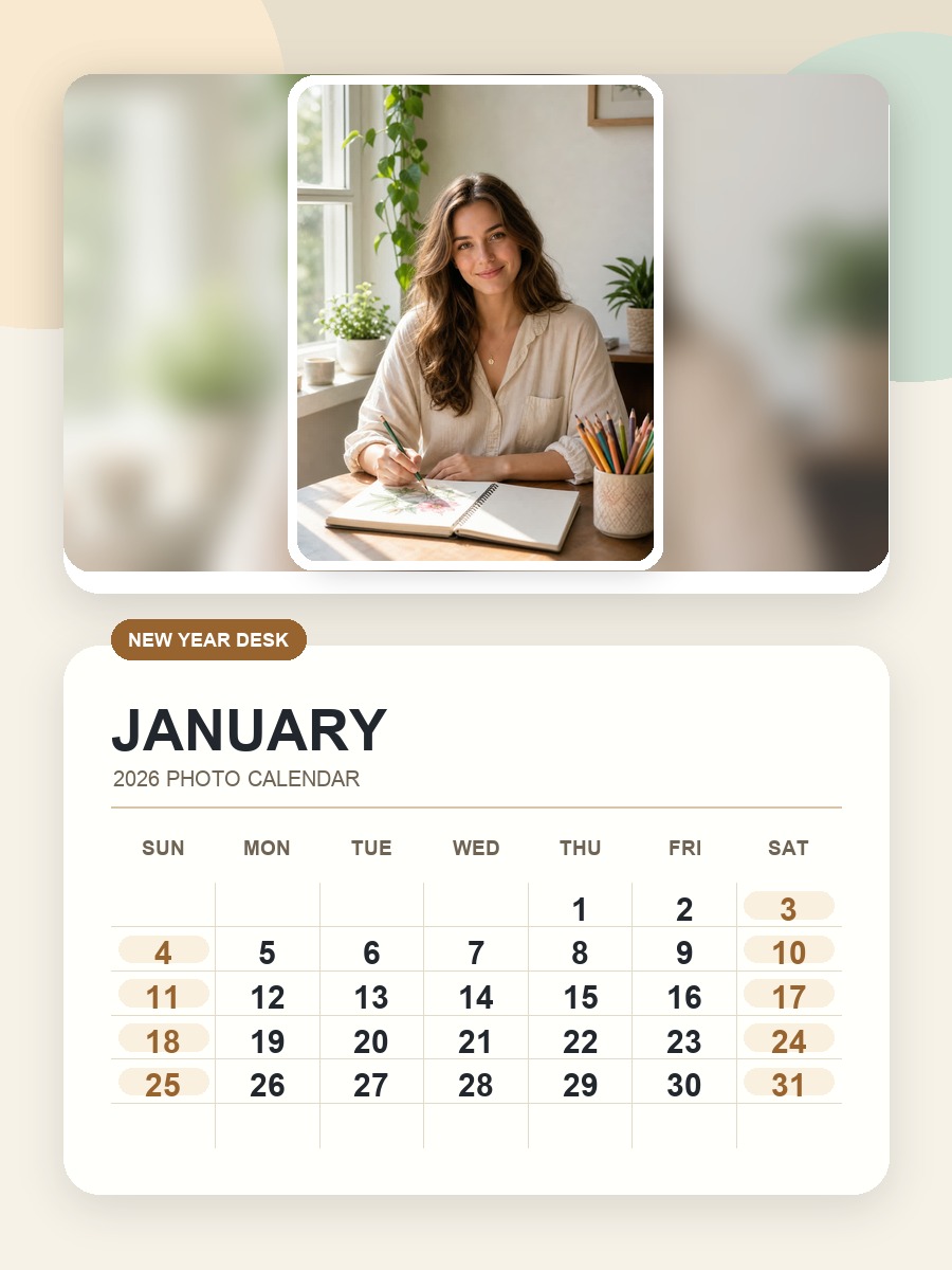
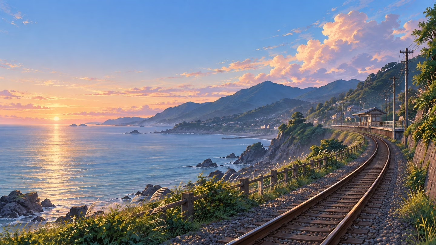
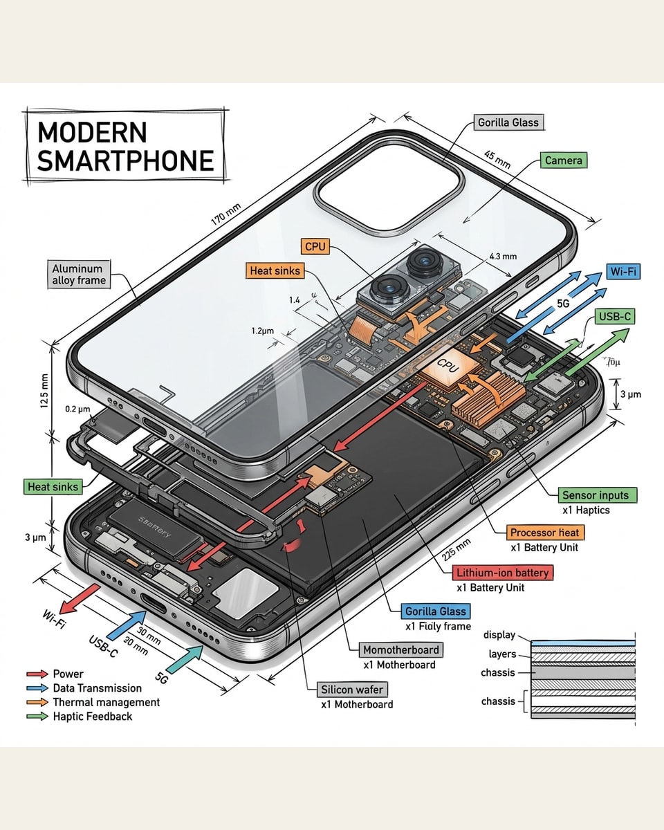
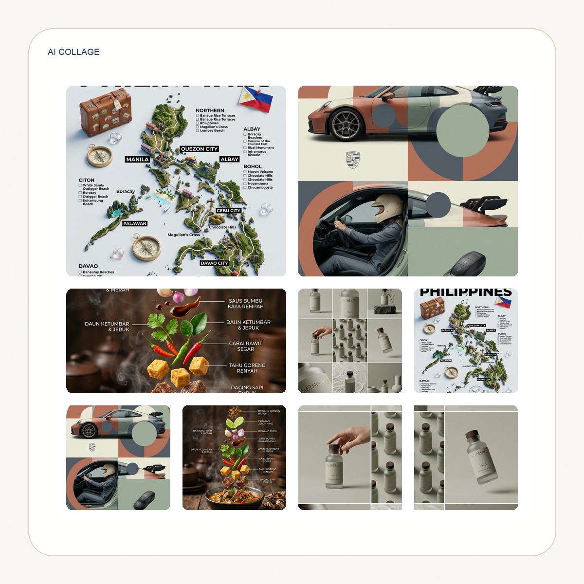
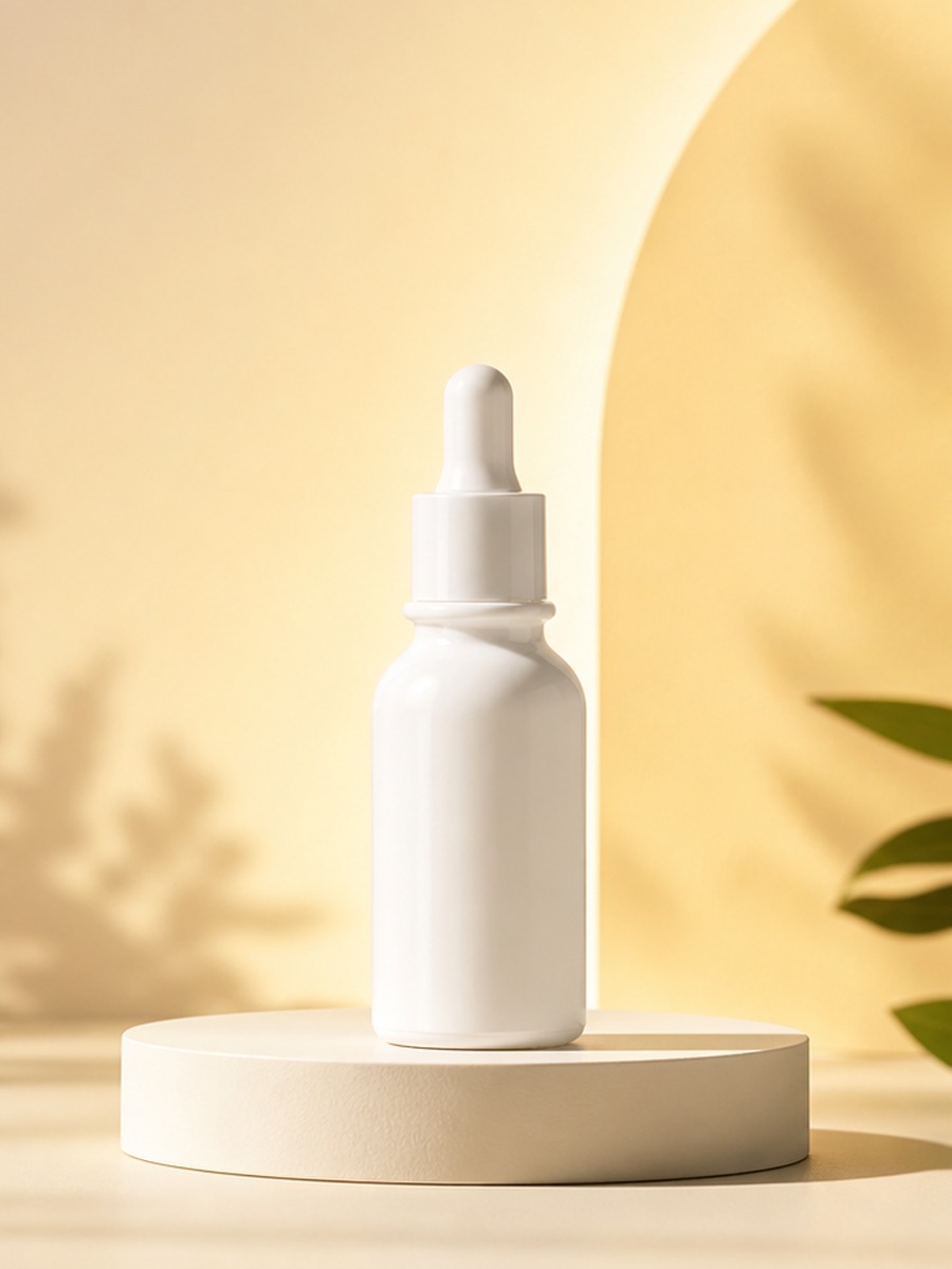
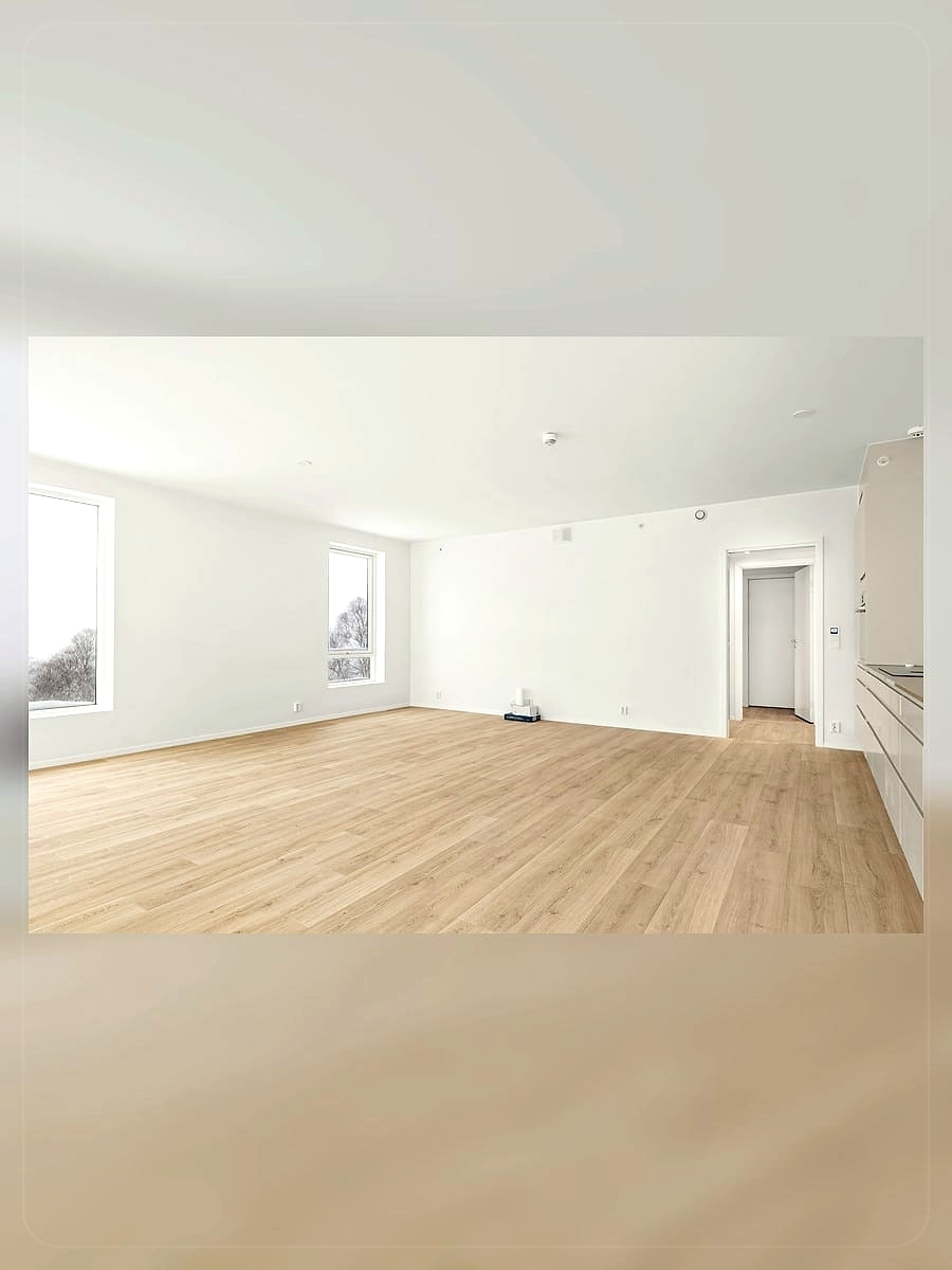
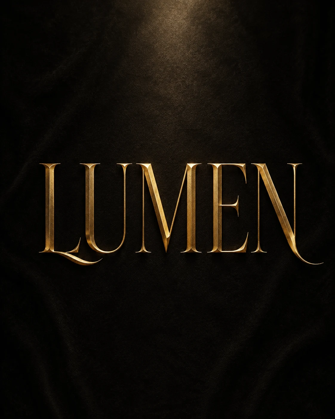
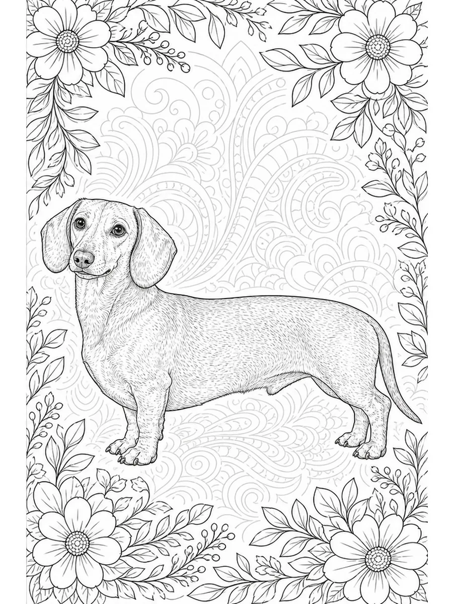


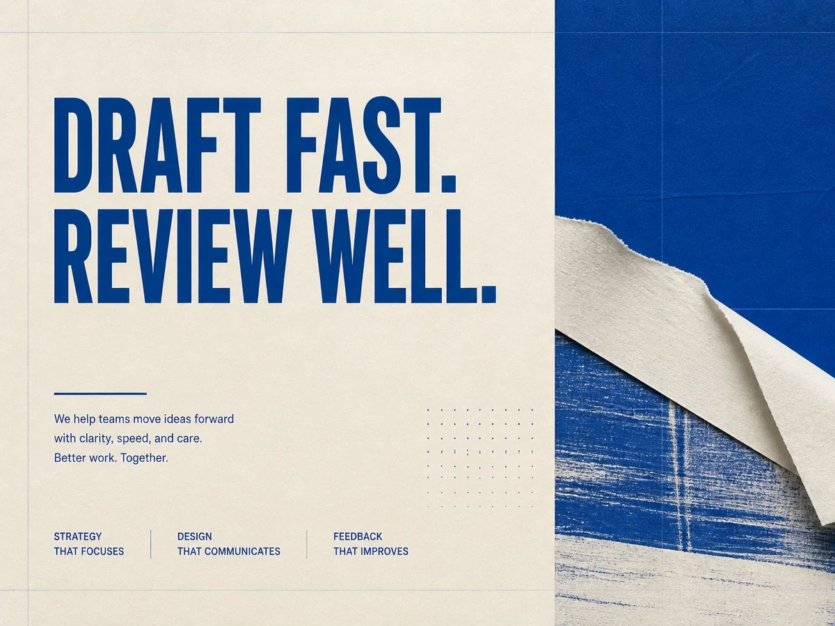
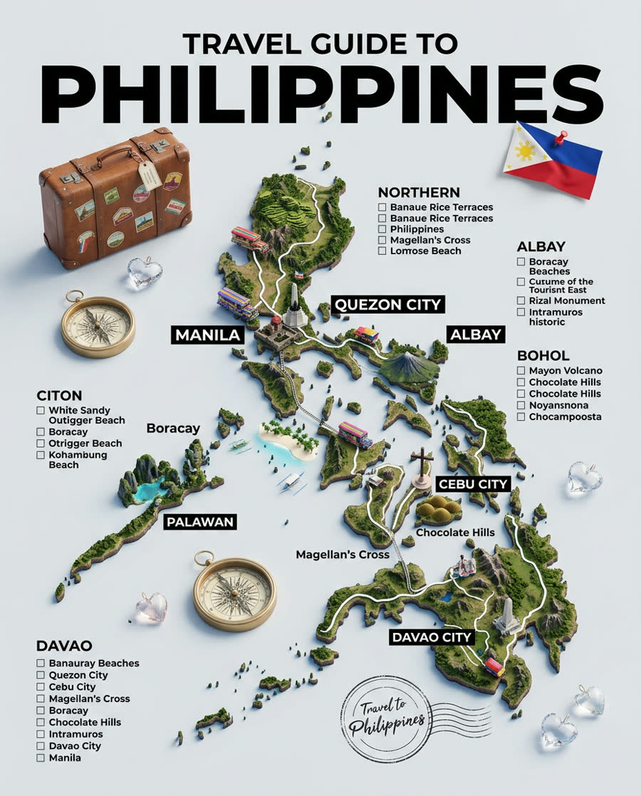
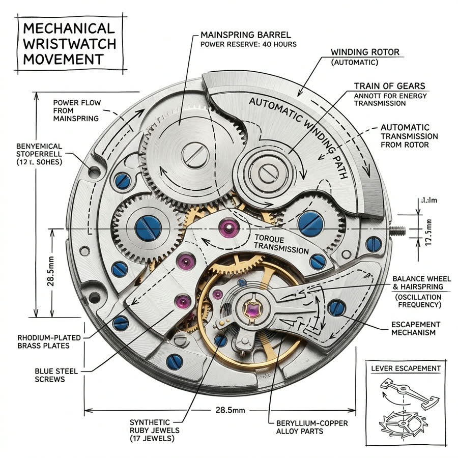
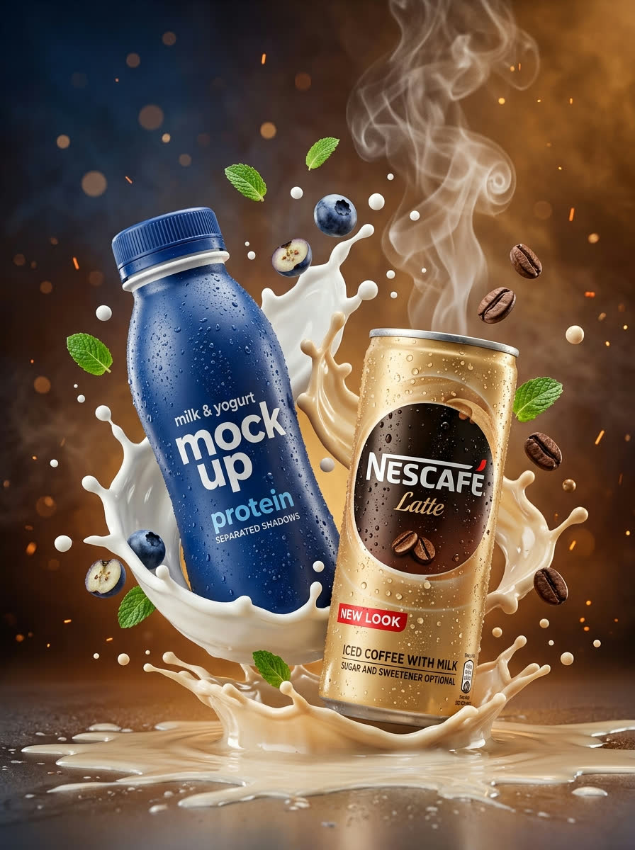


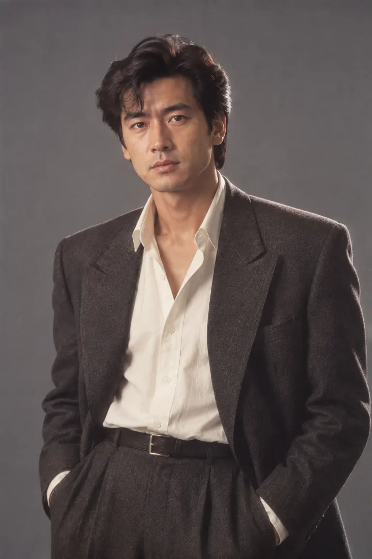
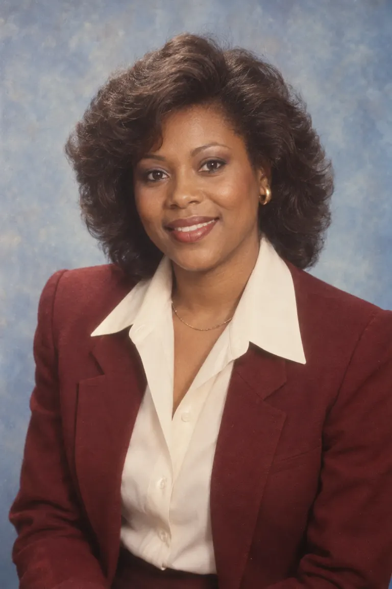
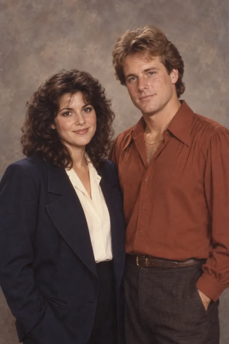
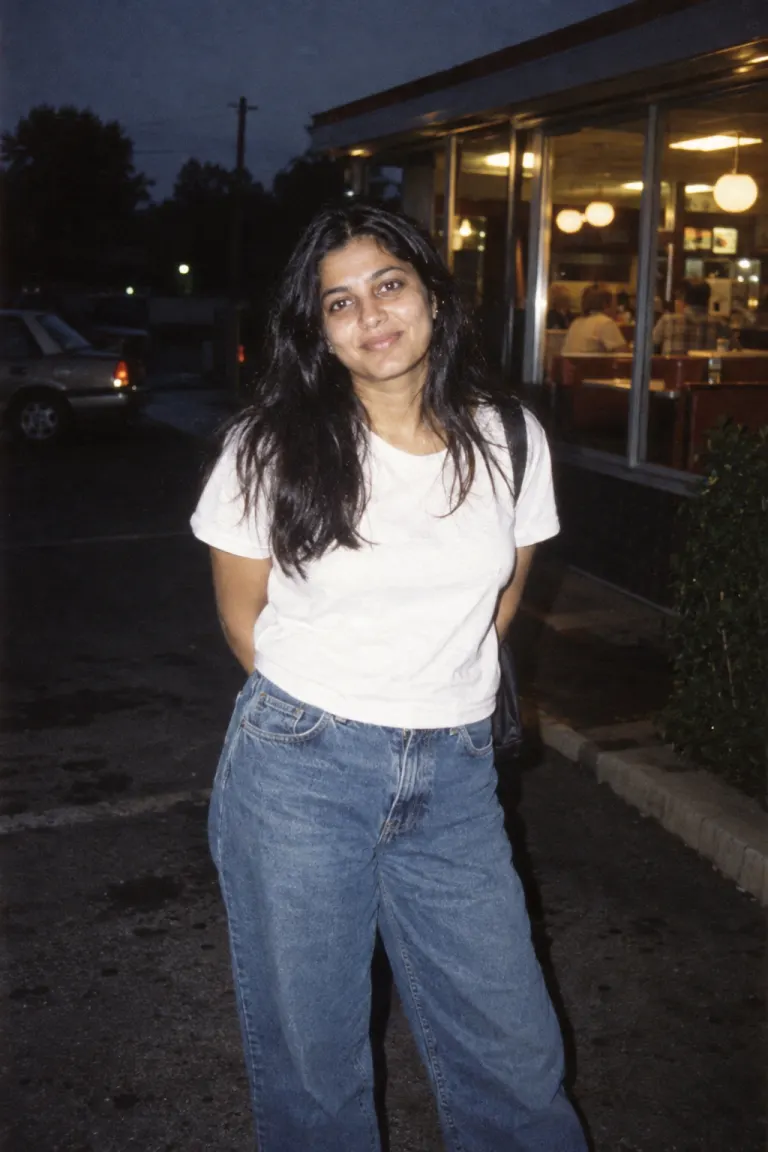
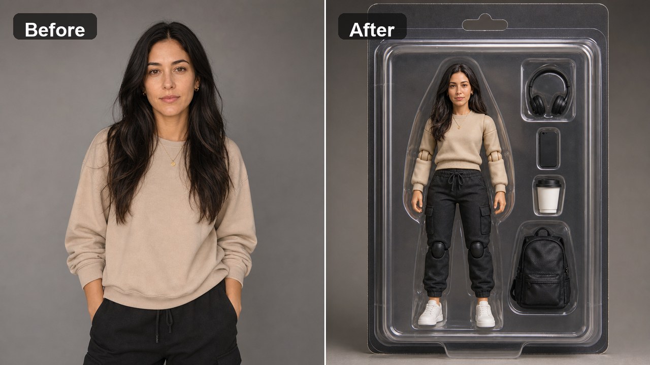
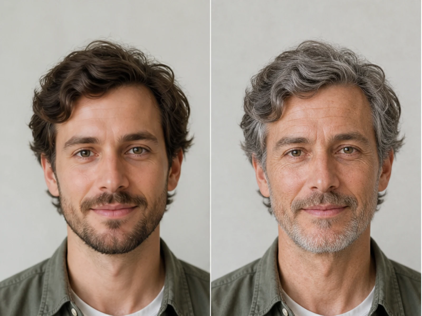
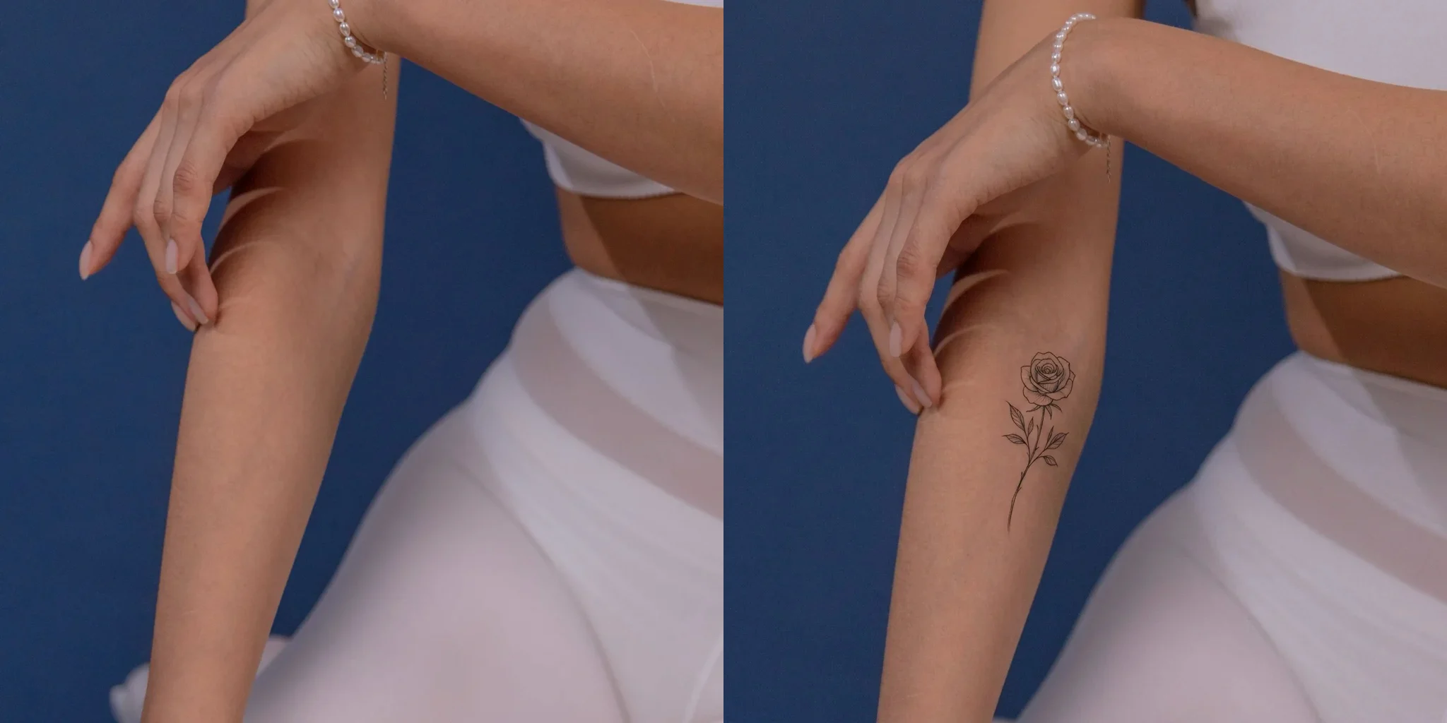
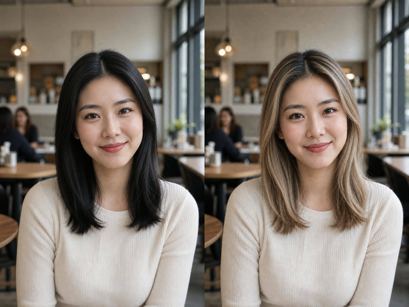
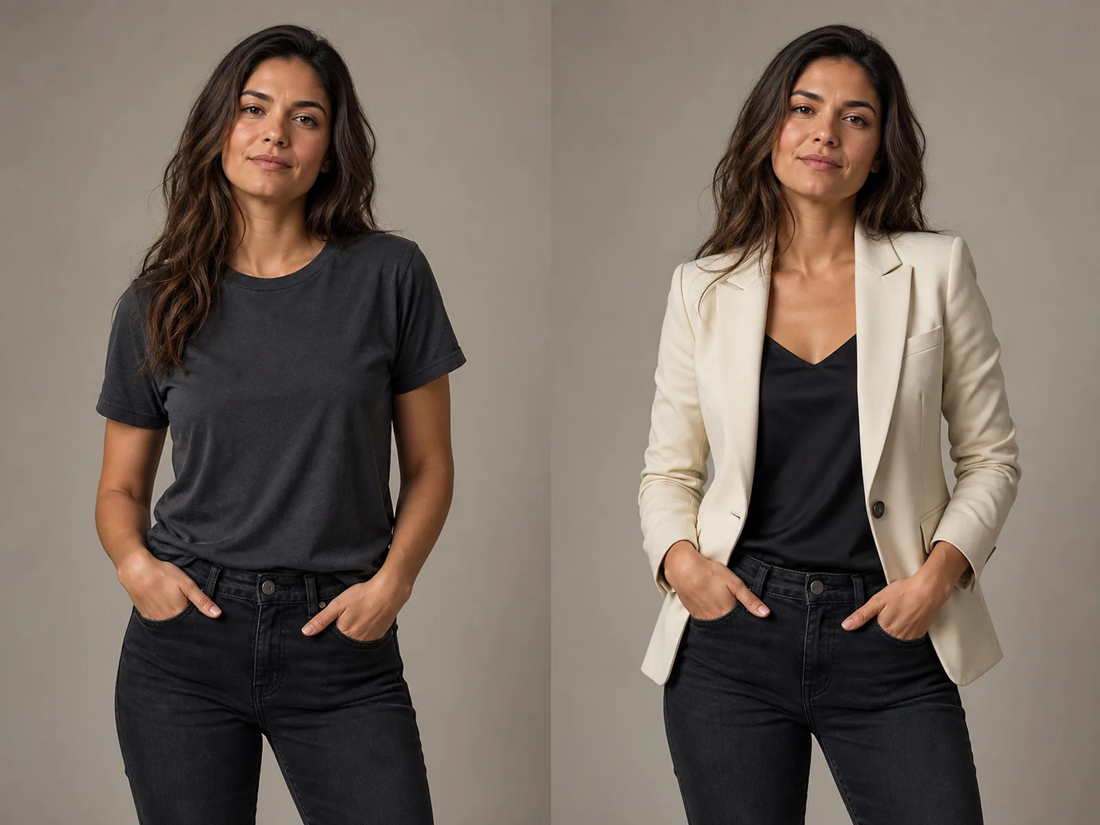
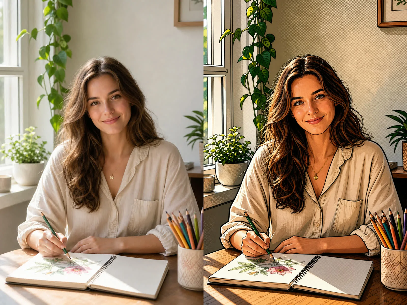
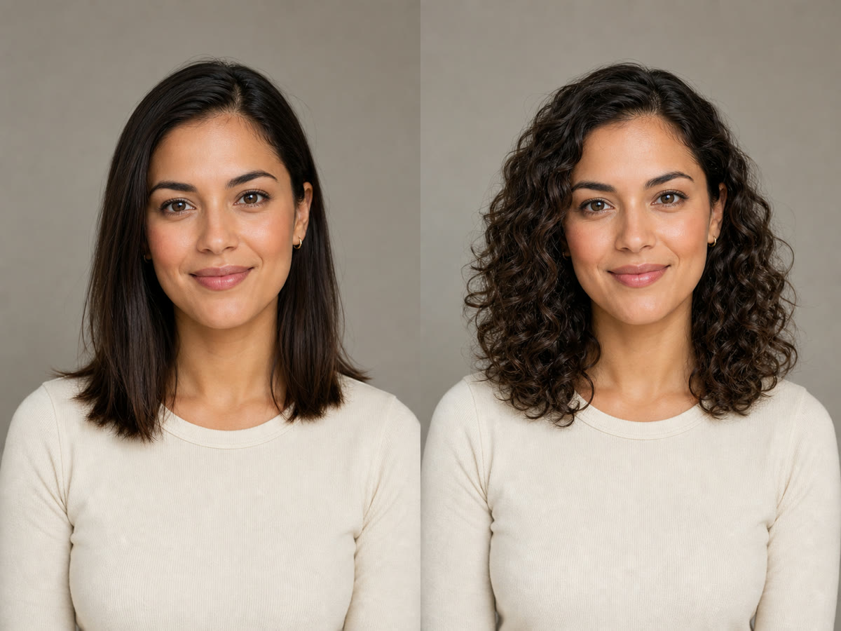
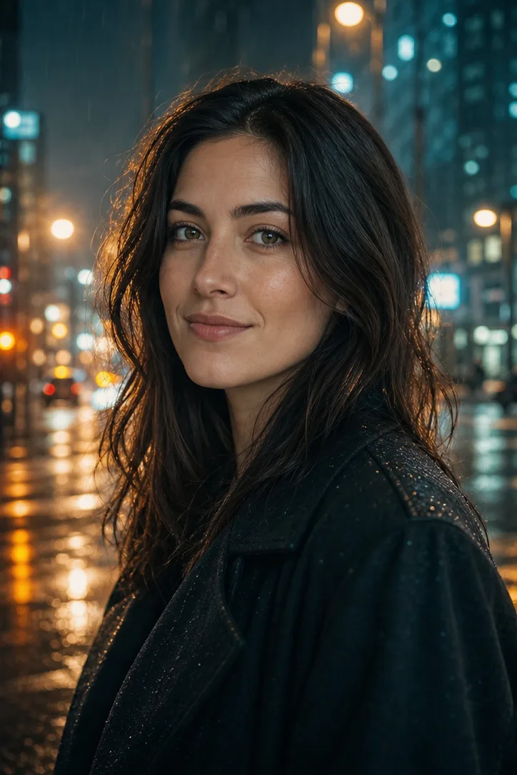
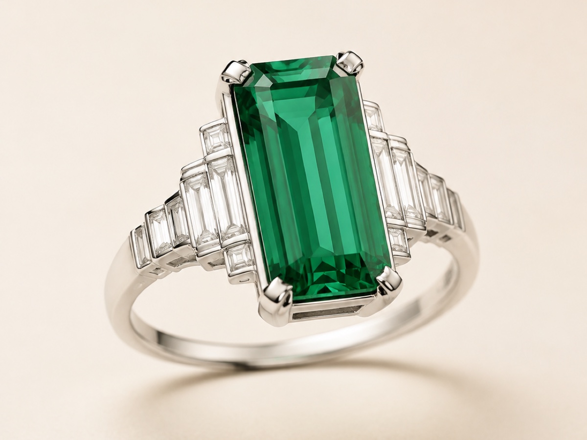
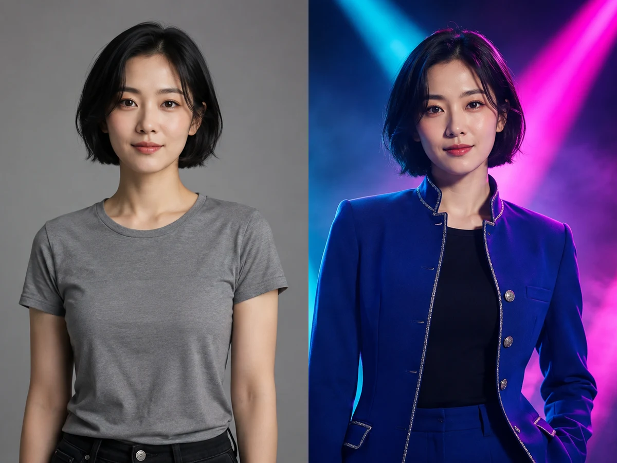
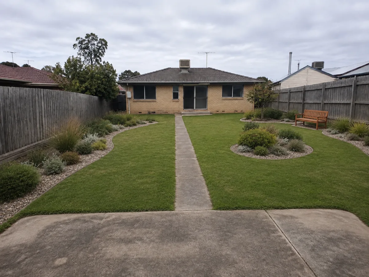
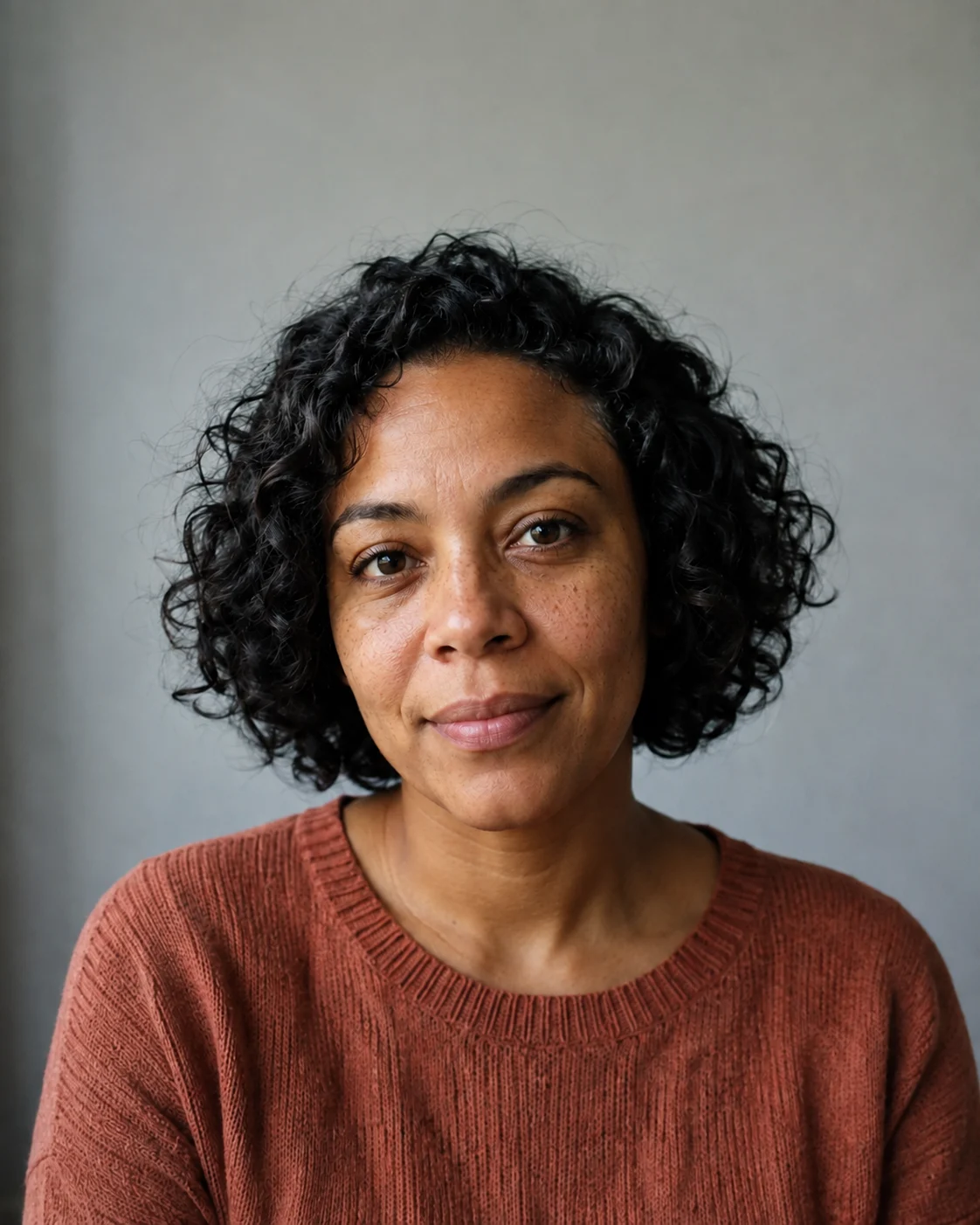
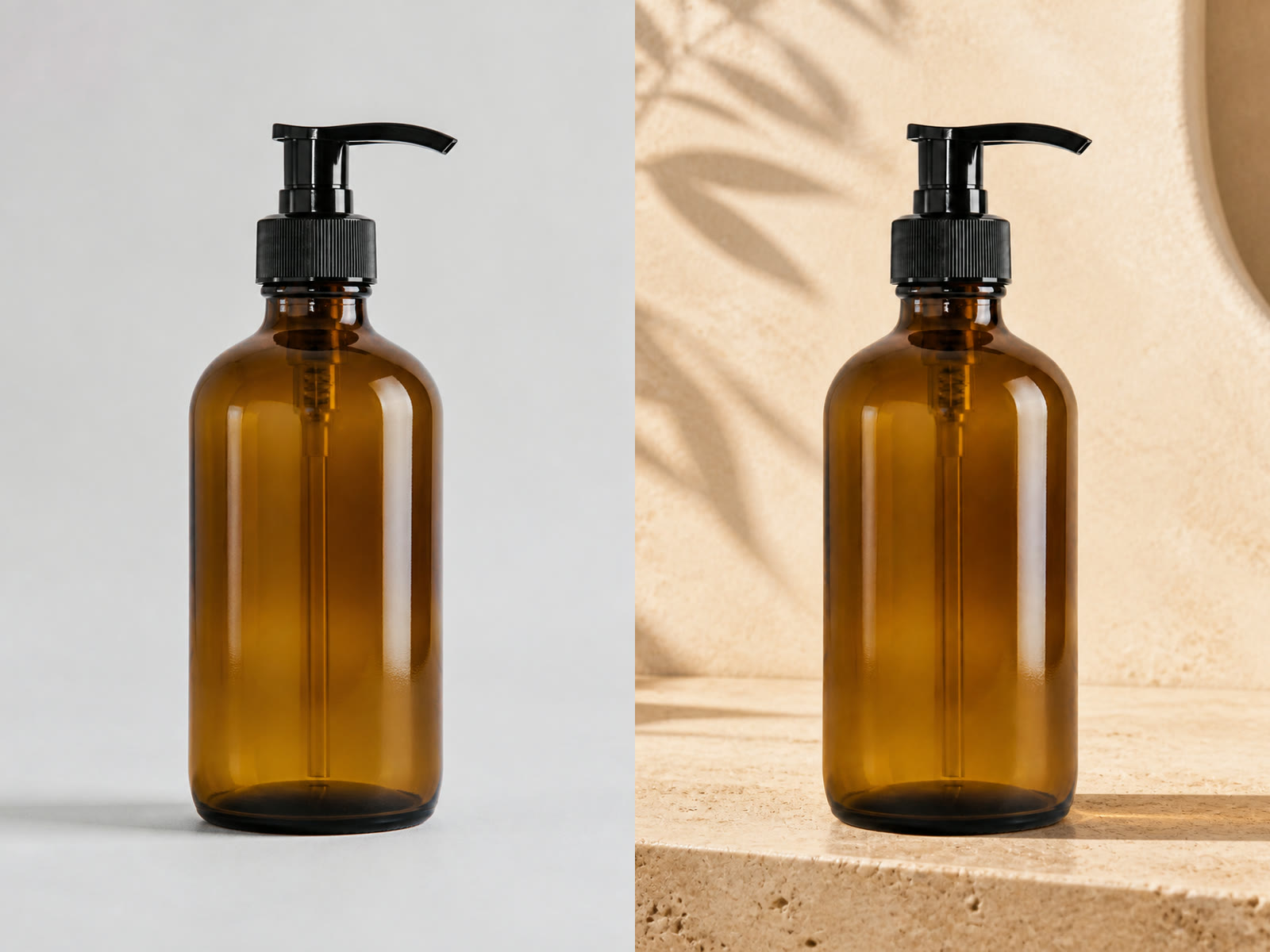
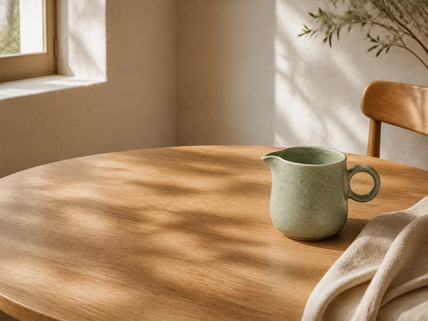
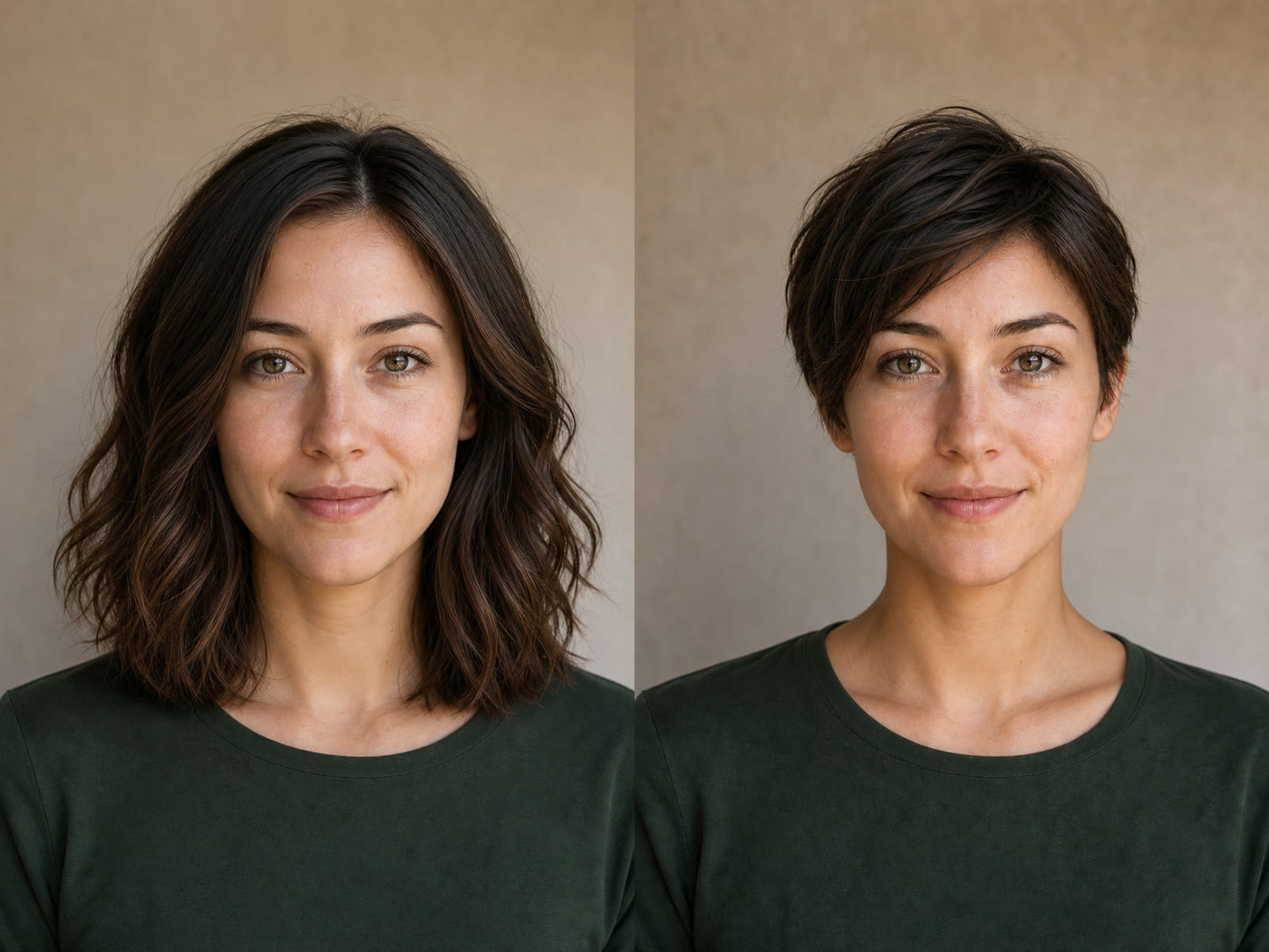

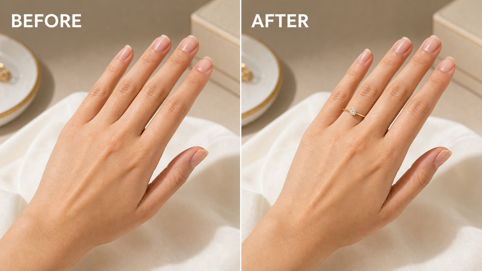
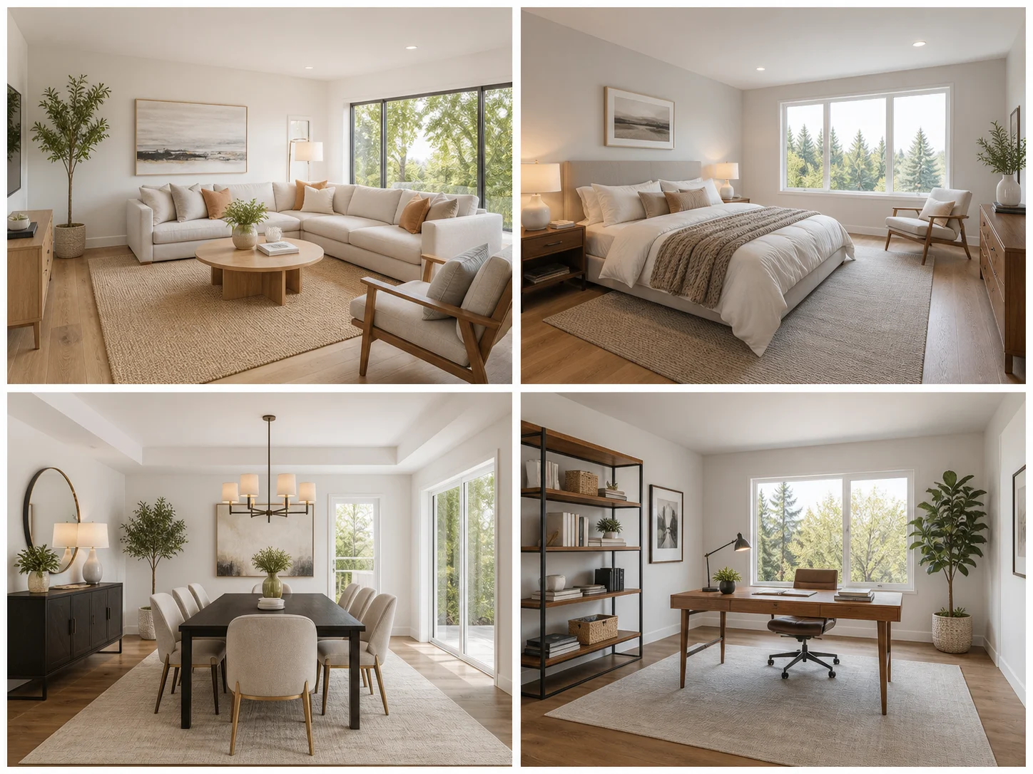
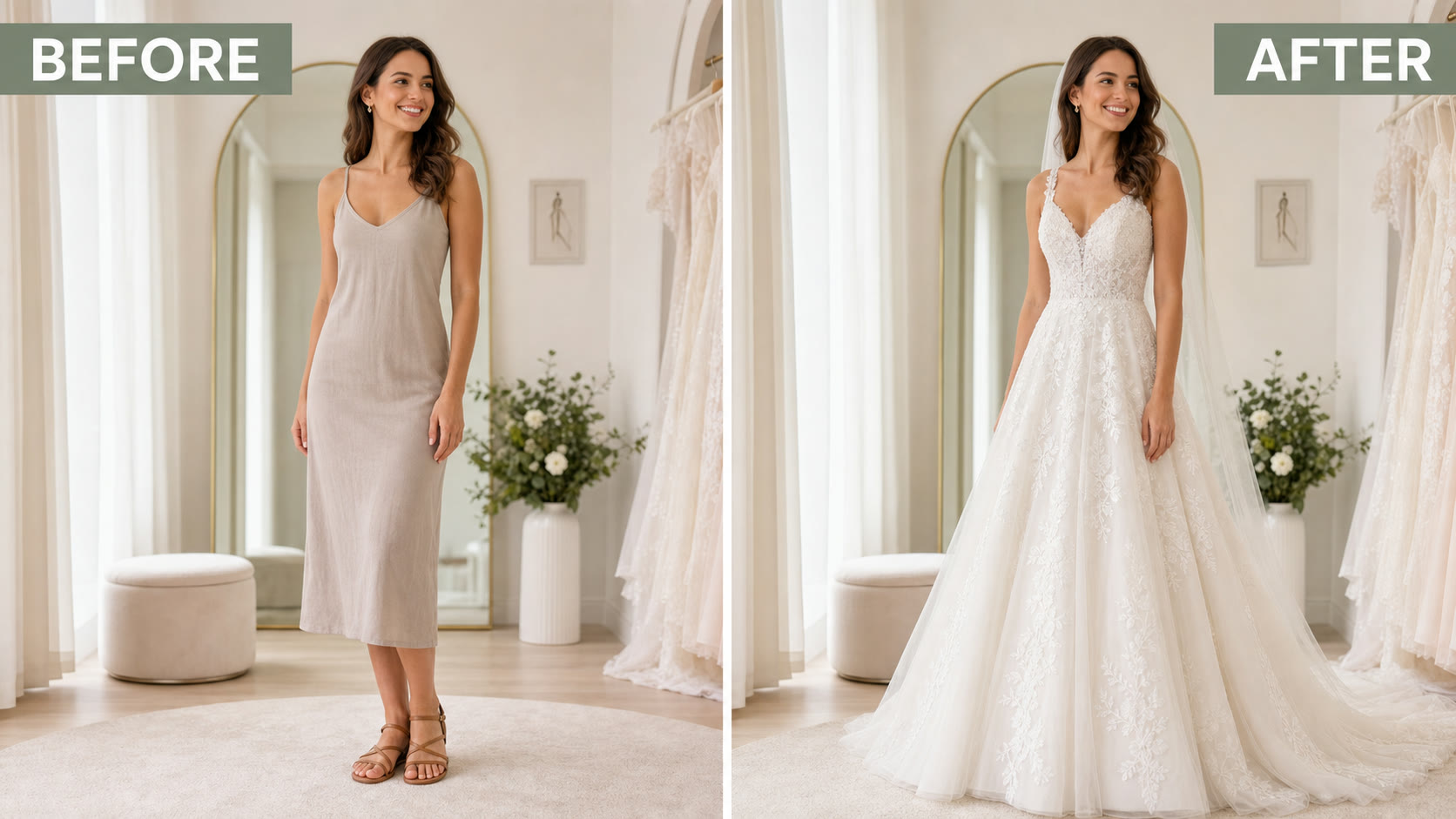
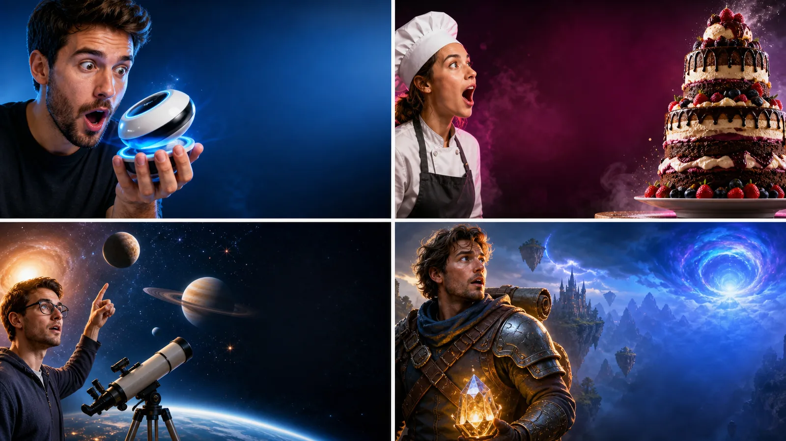
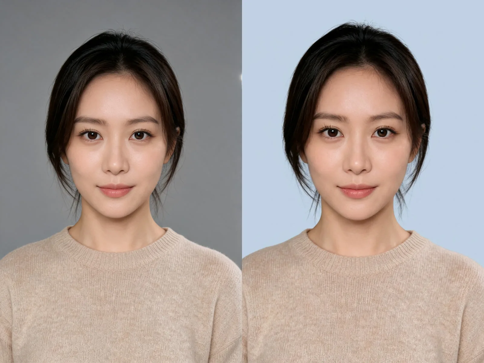
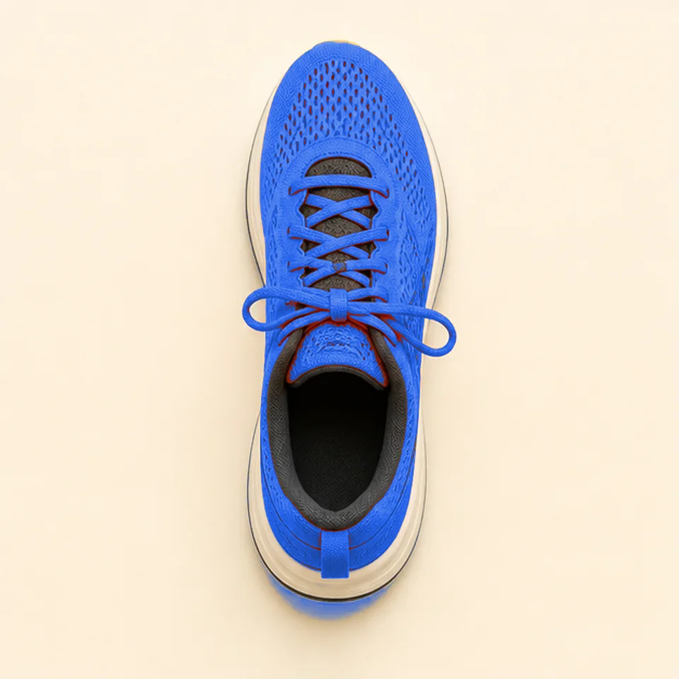
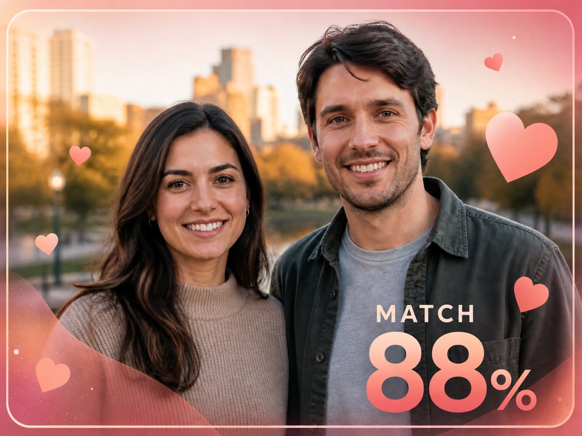
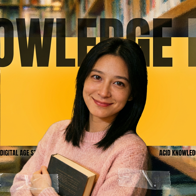
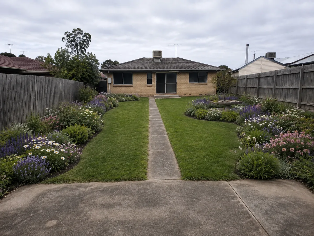
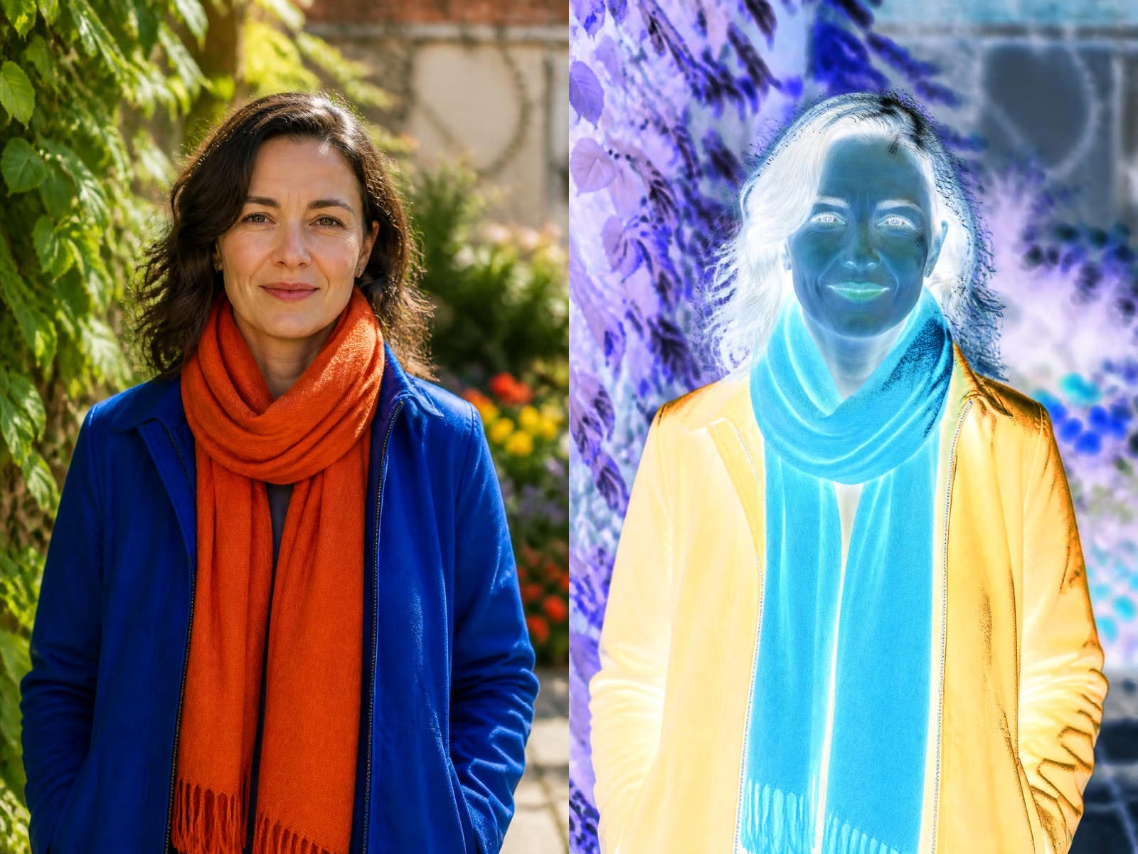
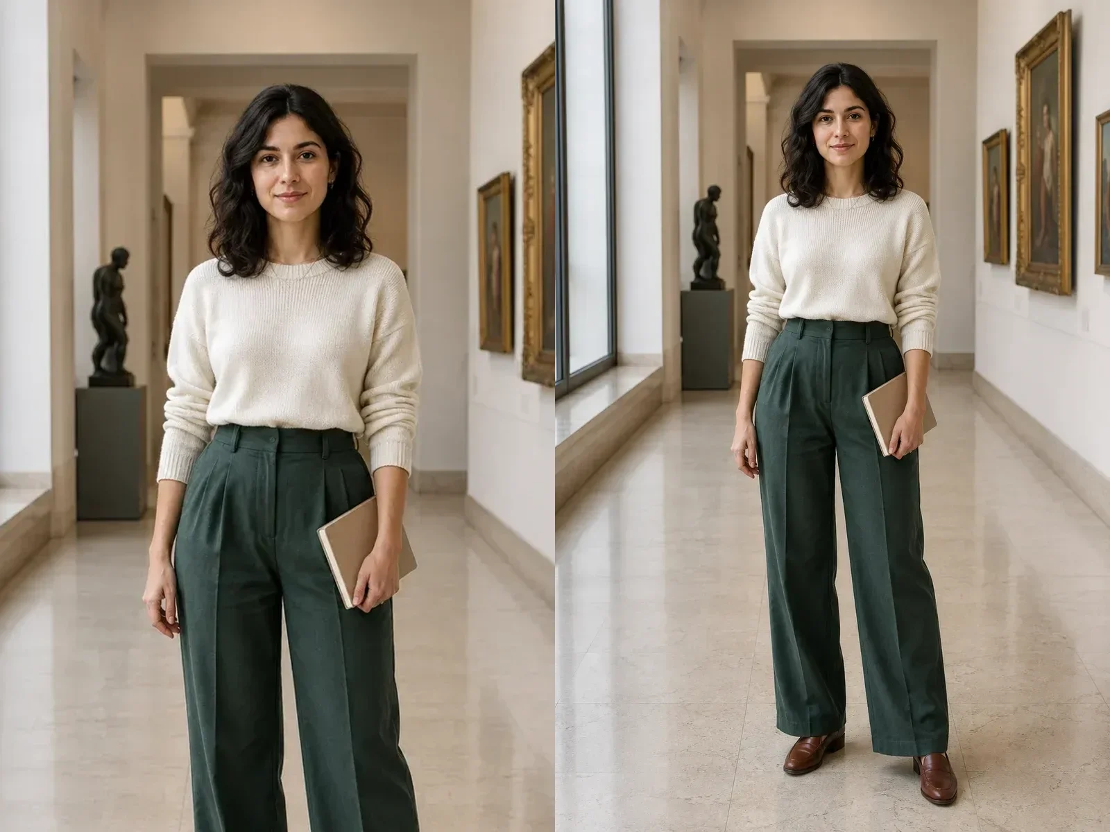
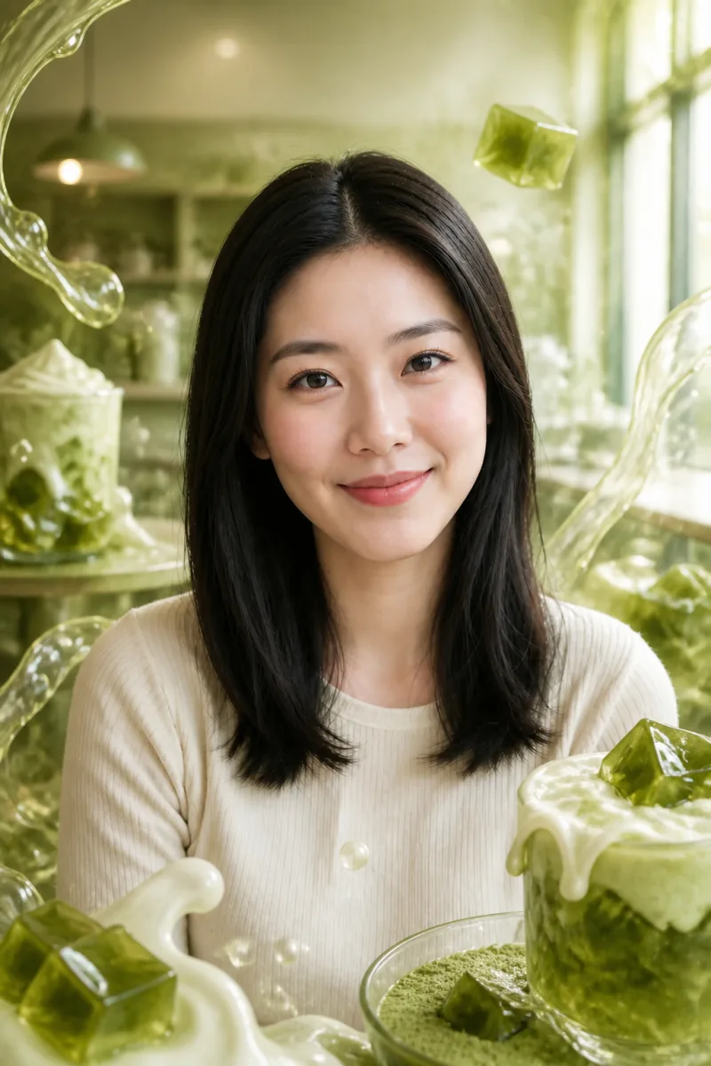
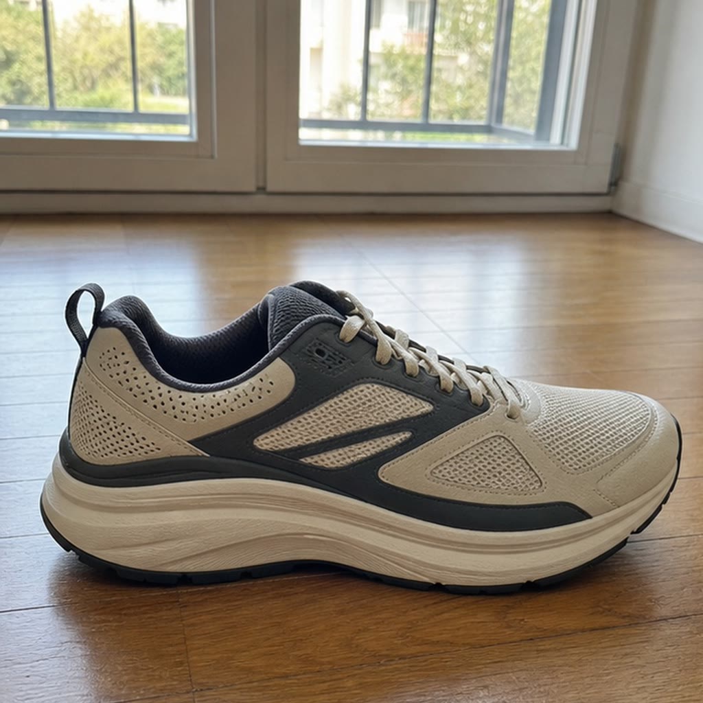
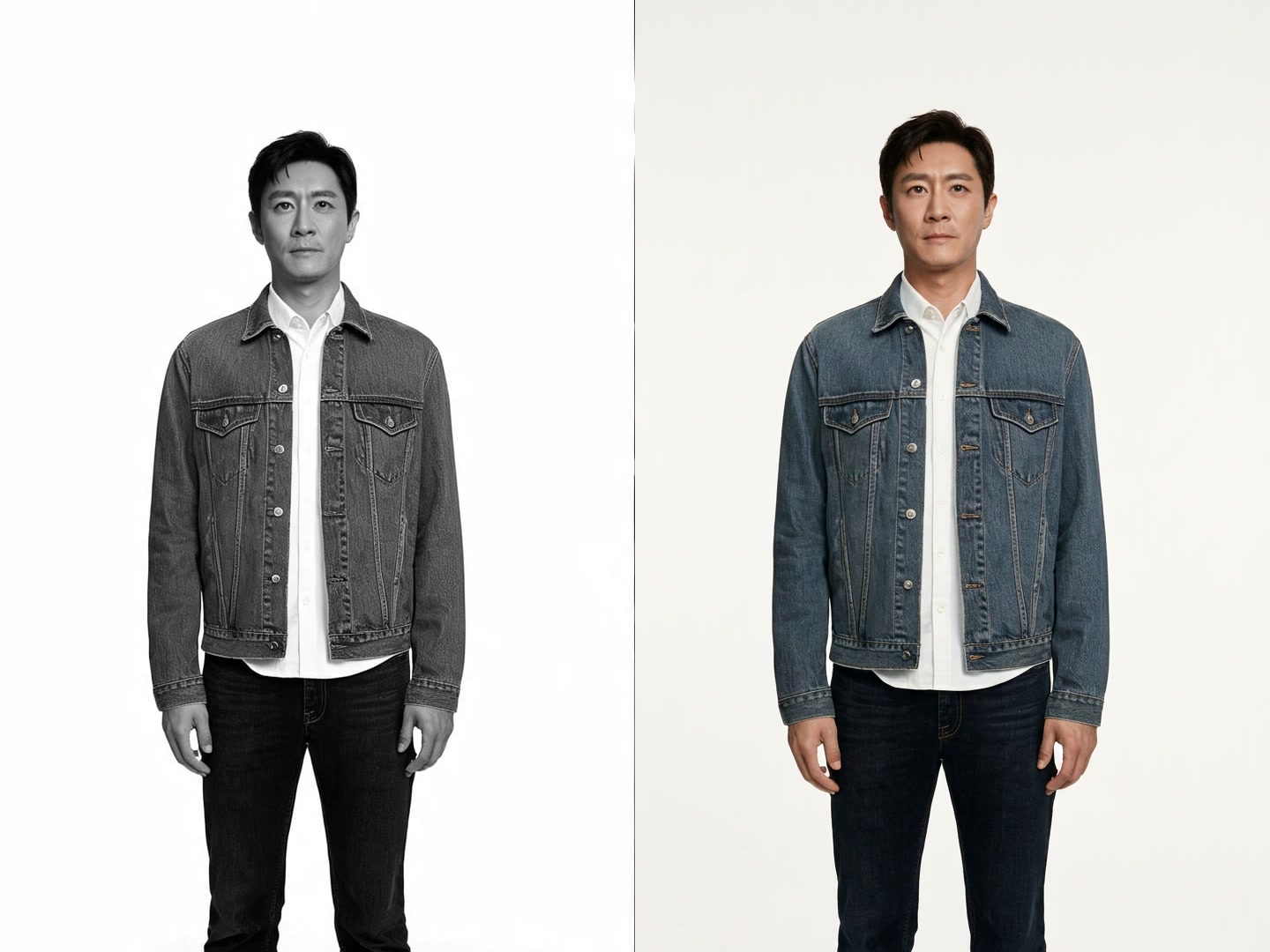
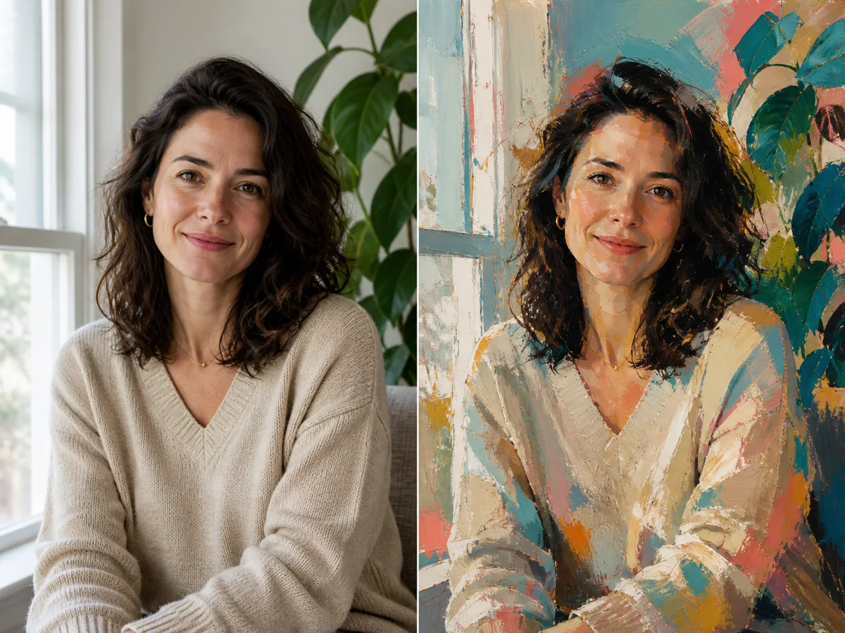
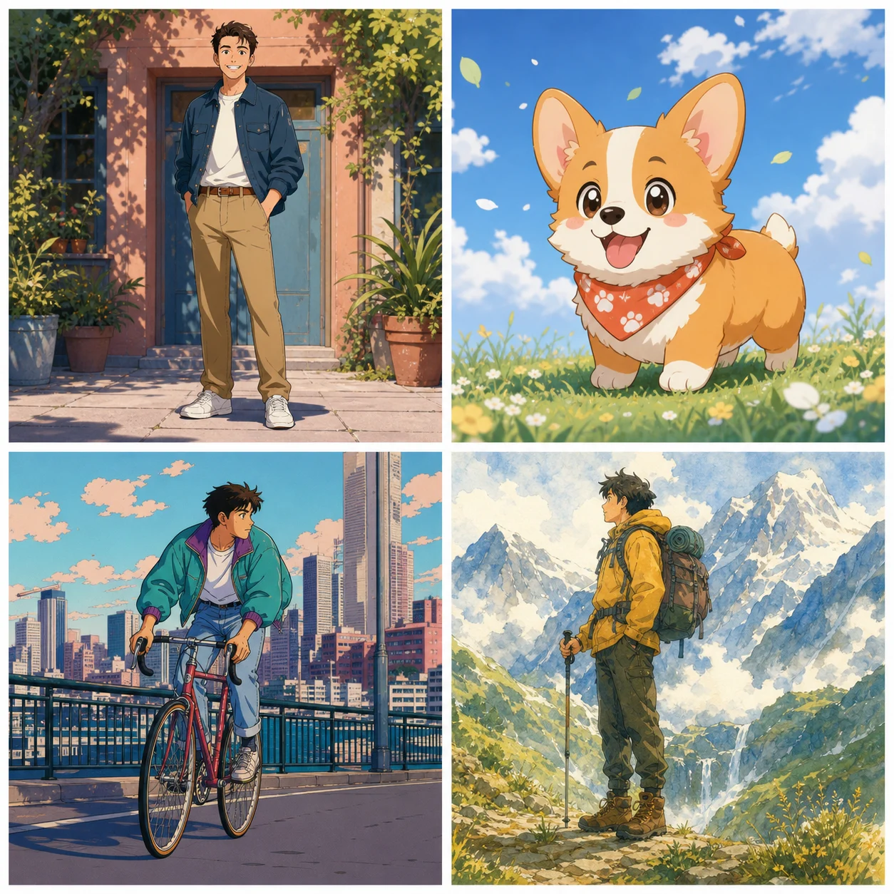
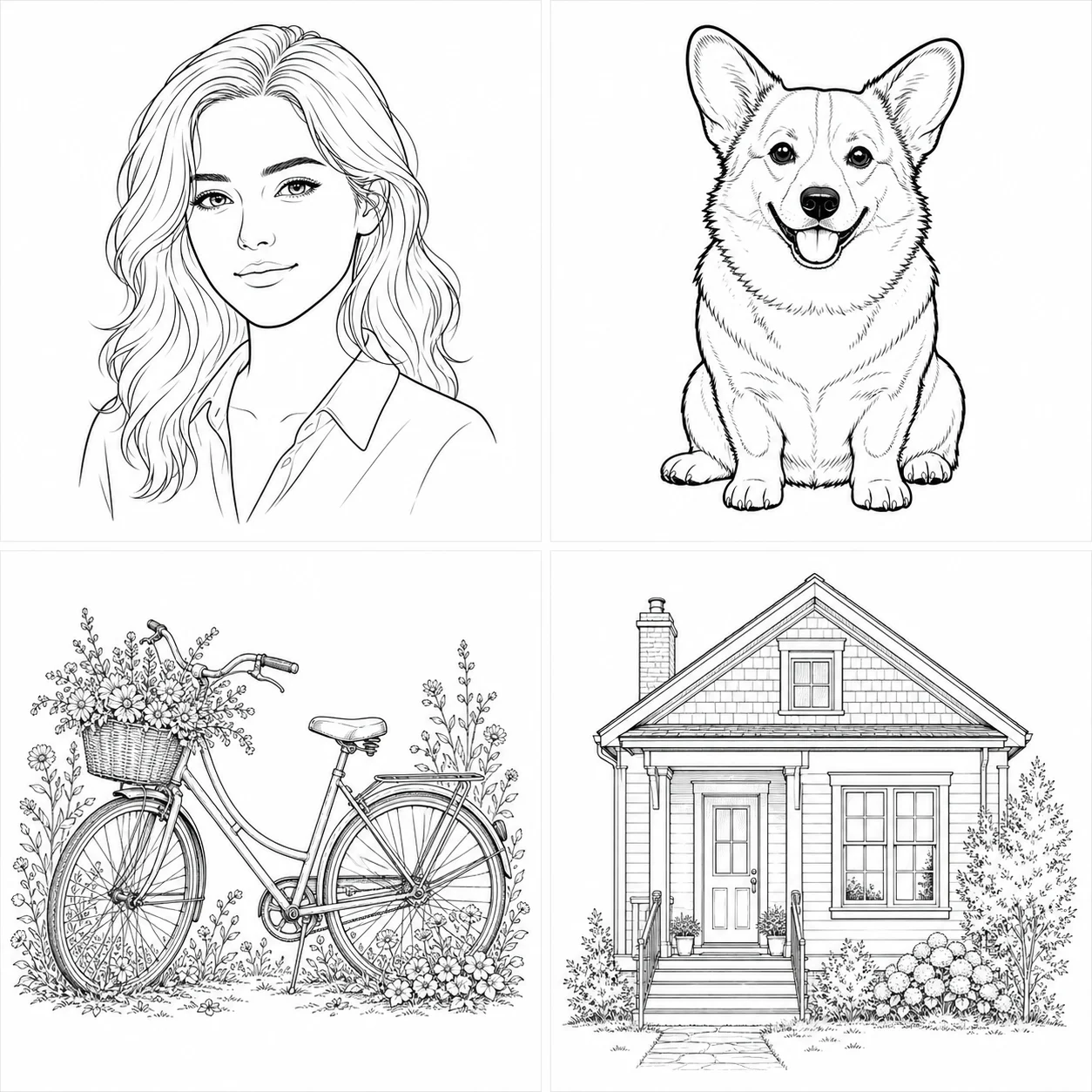
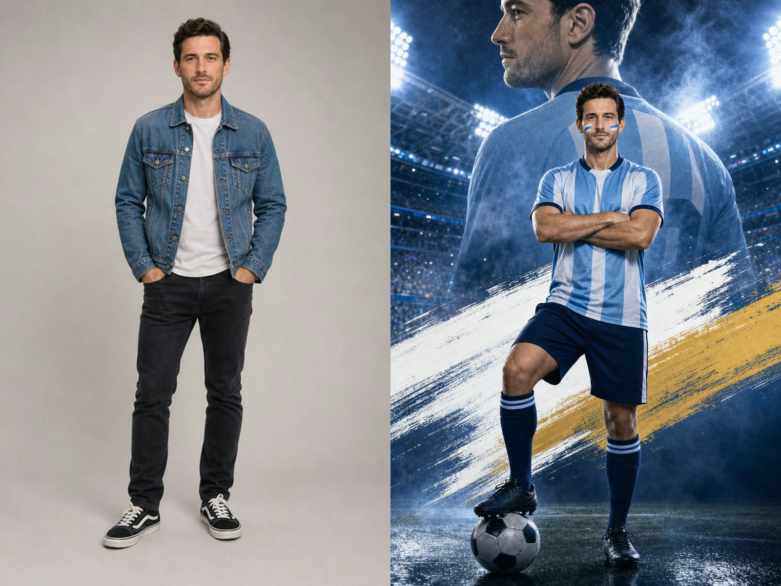
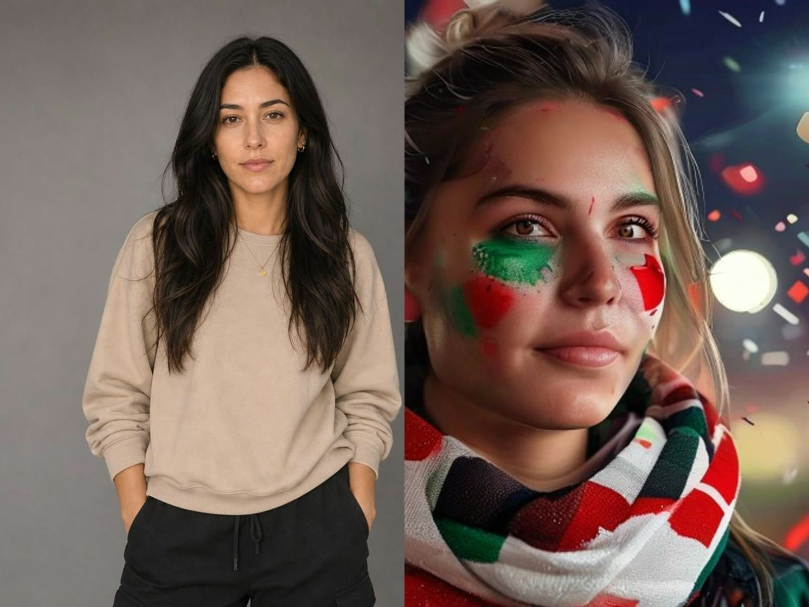
Turn an image brief into a workable design
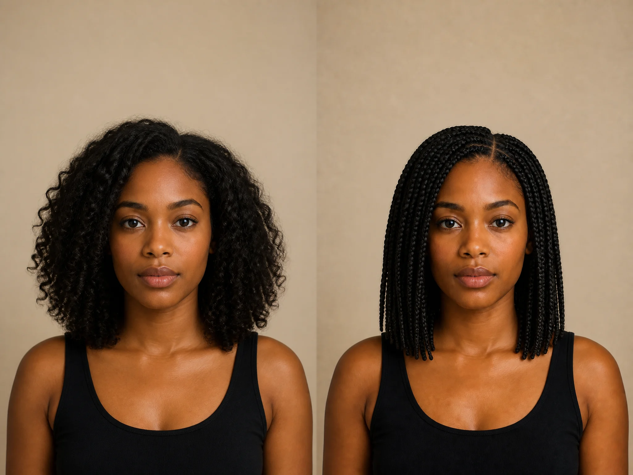
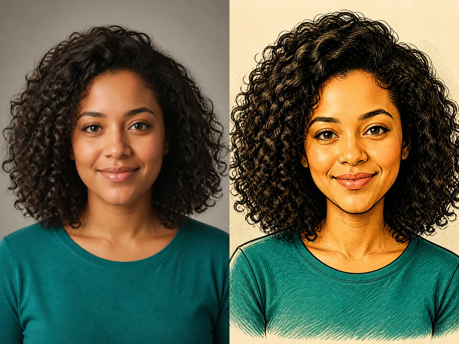
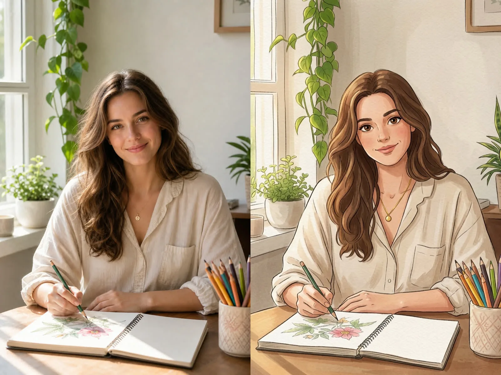
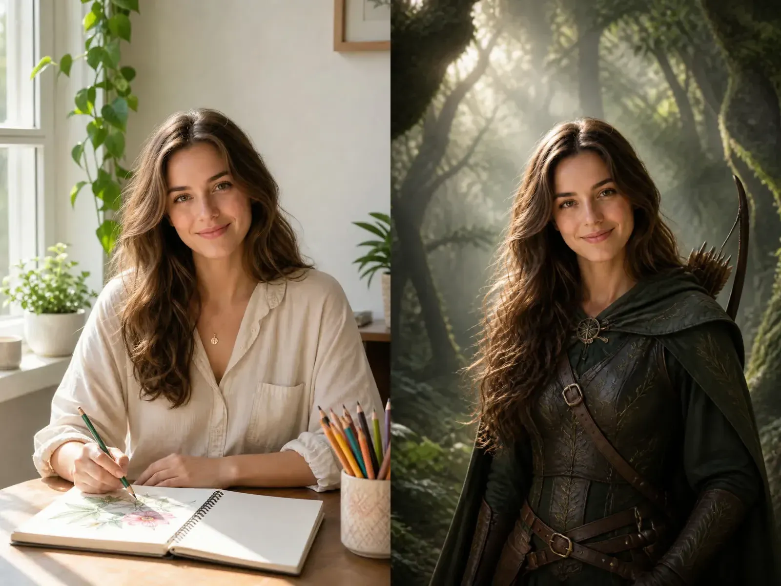
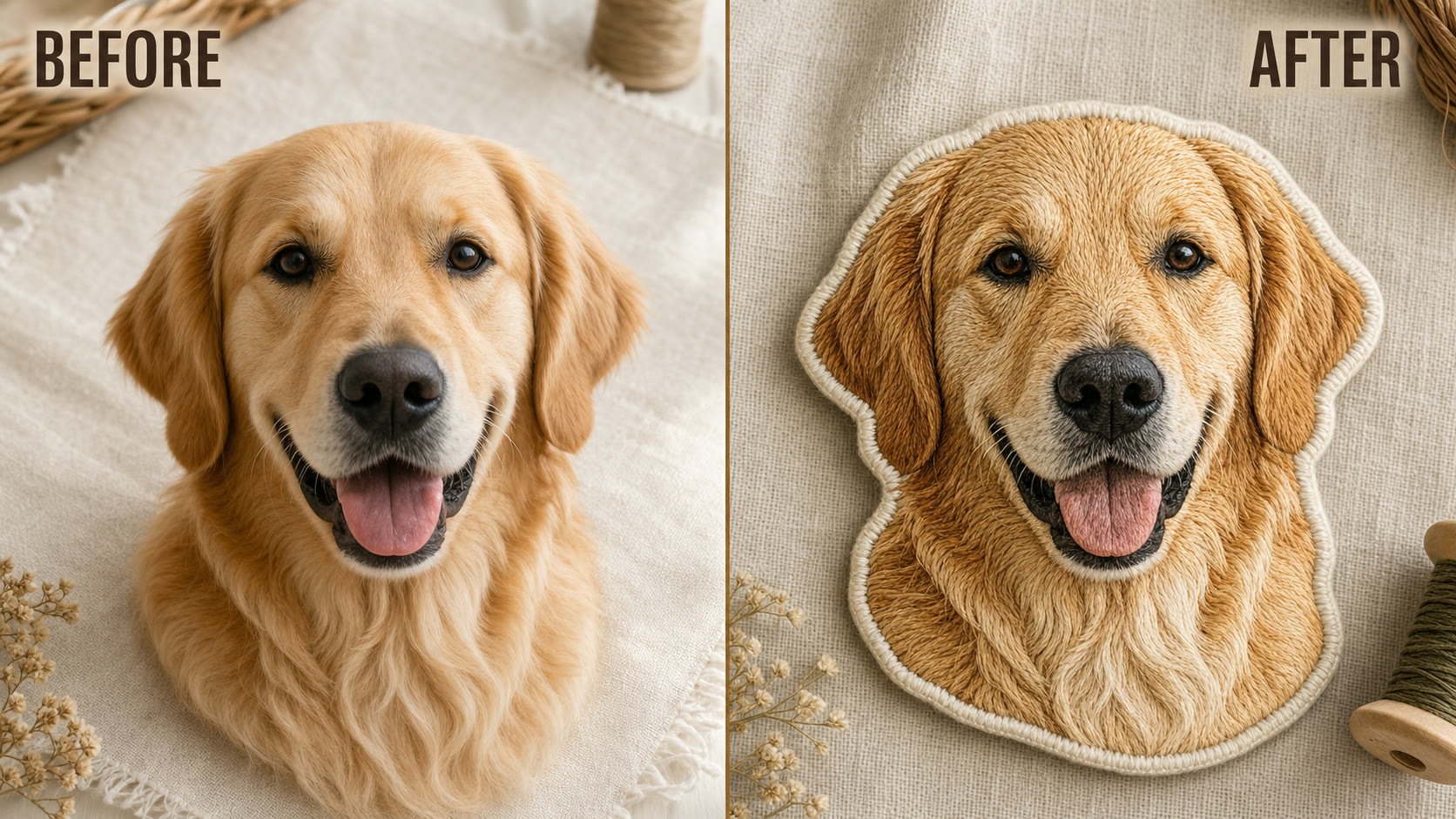
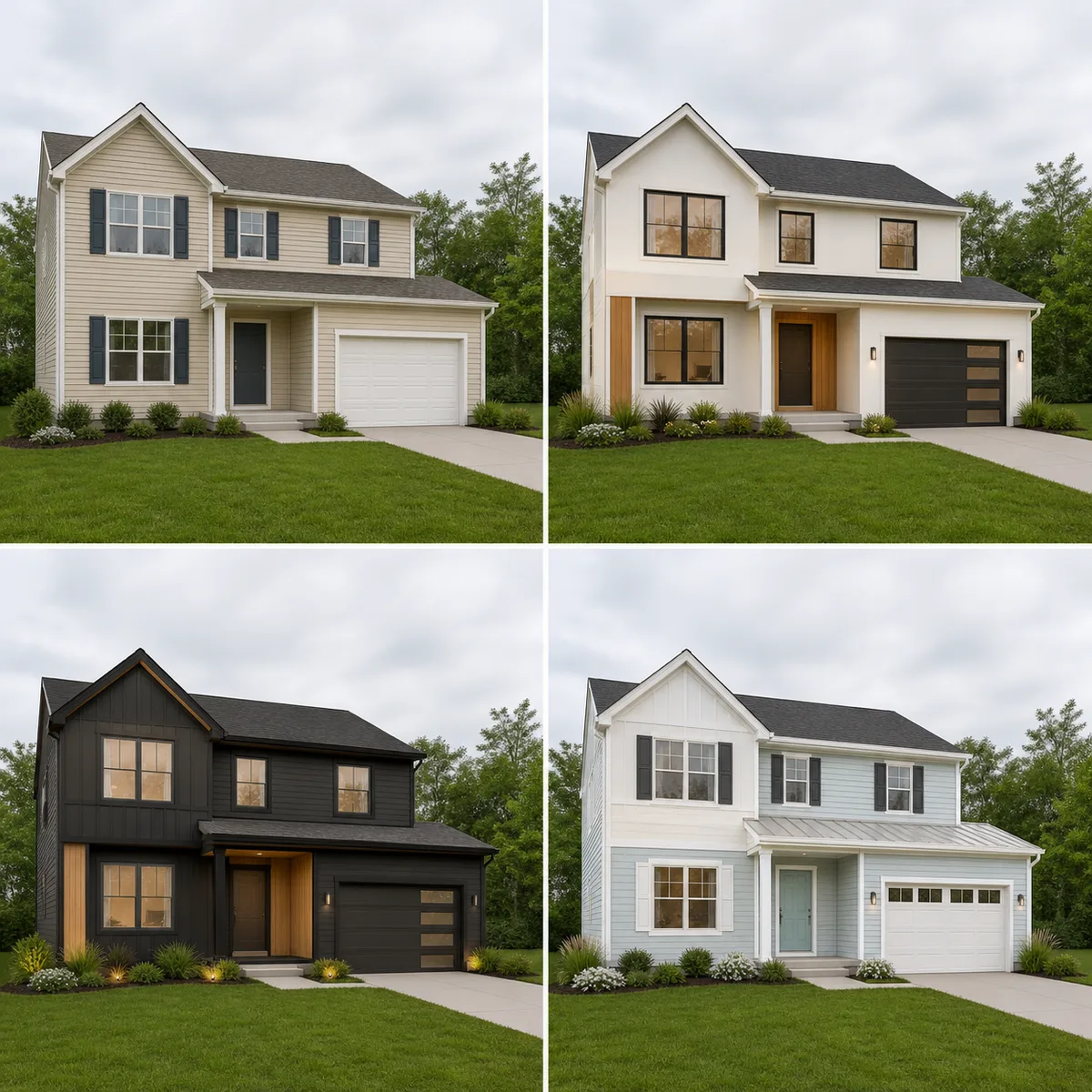
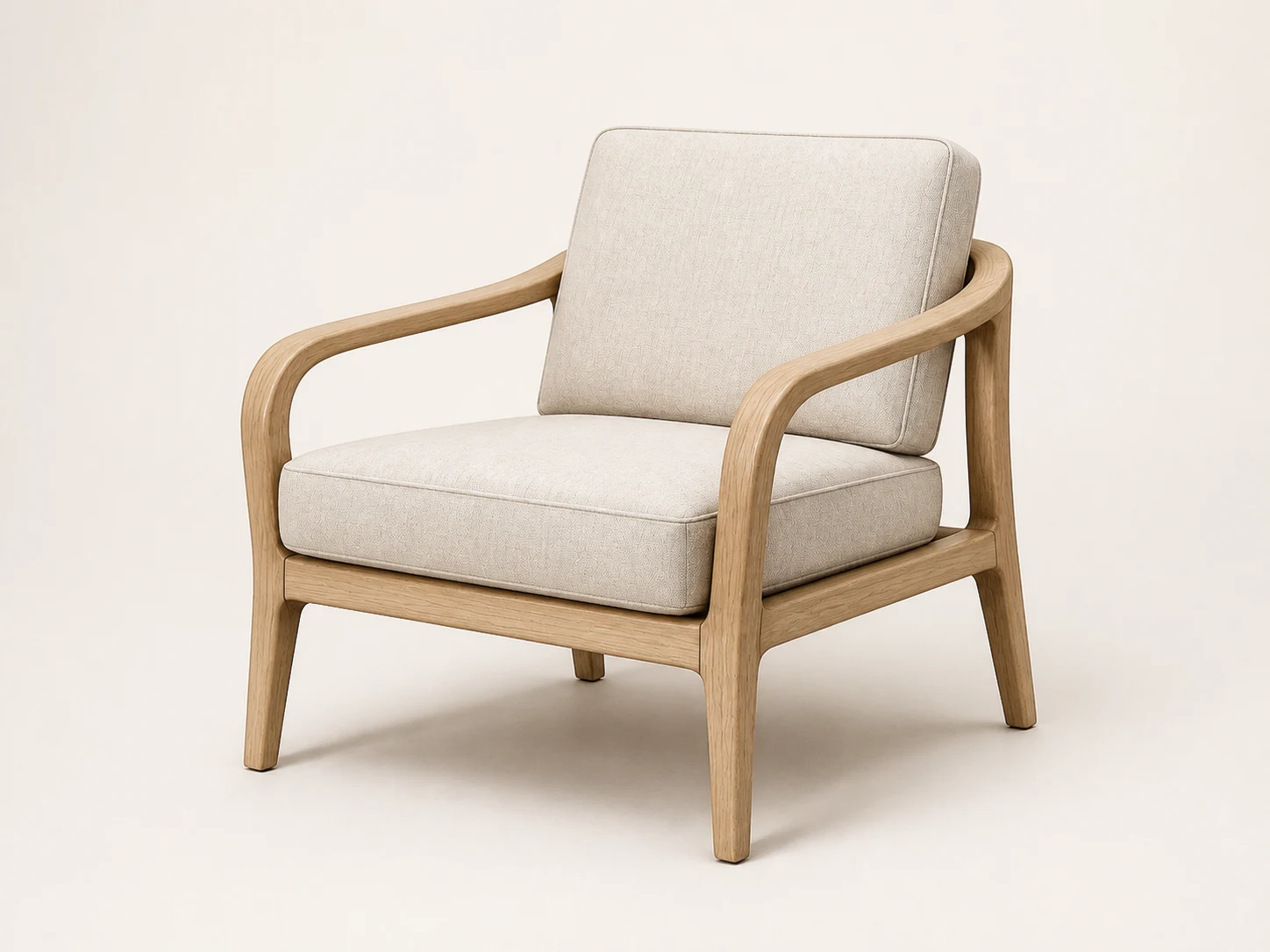
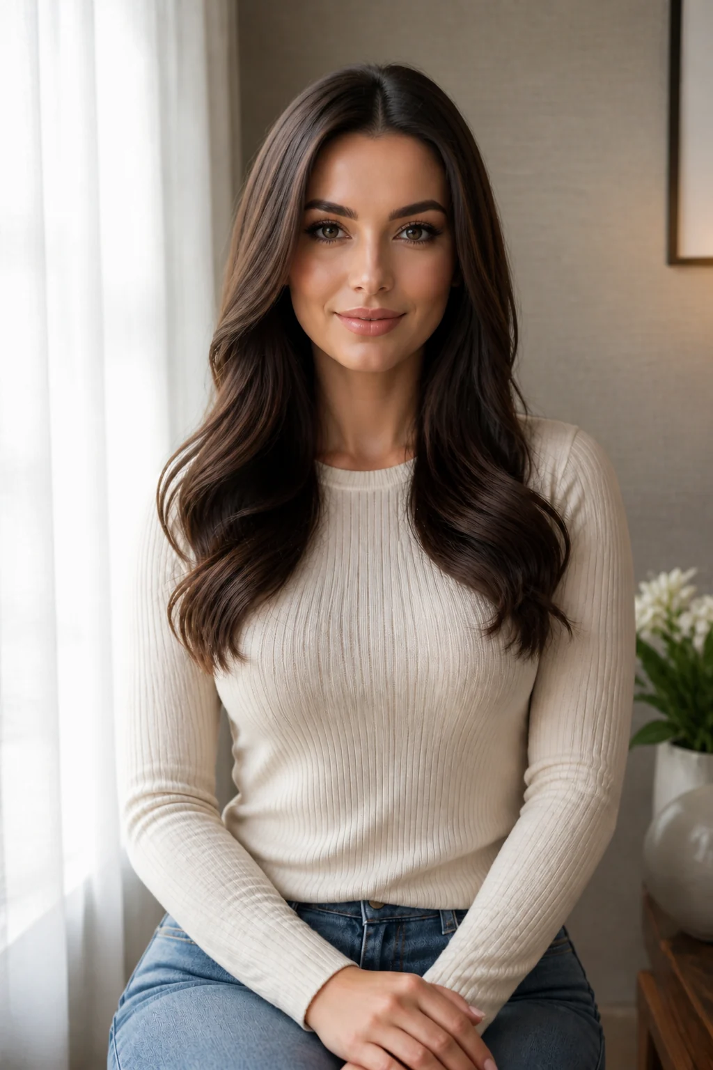
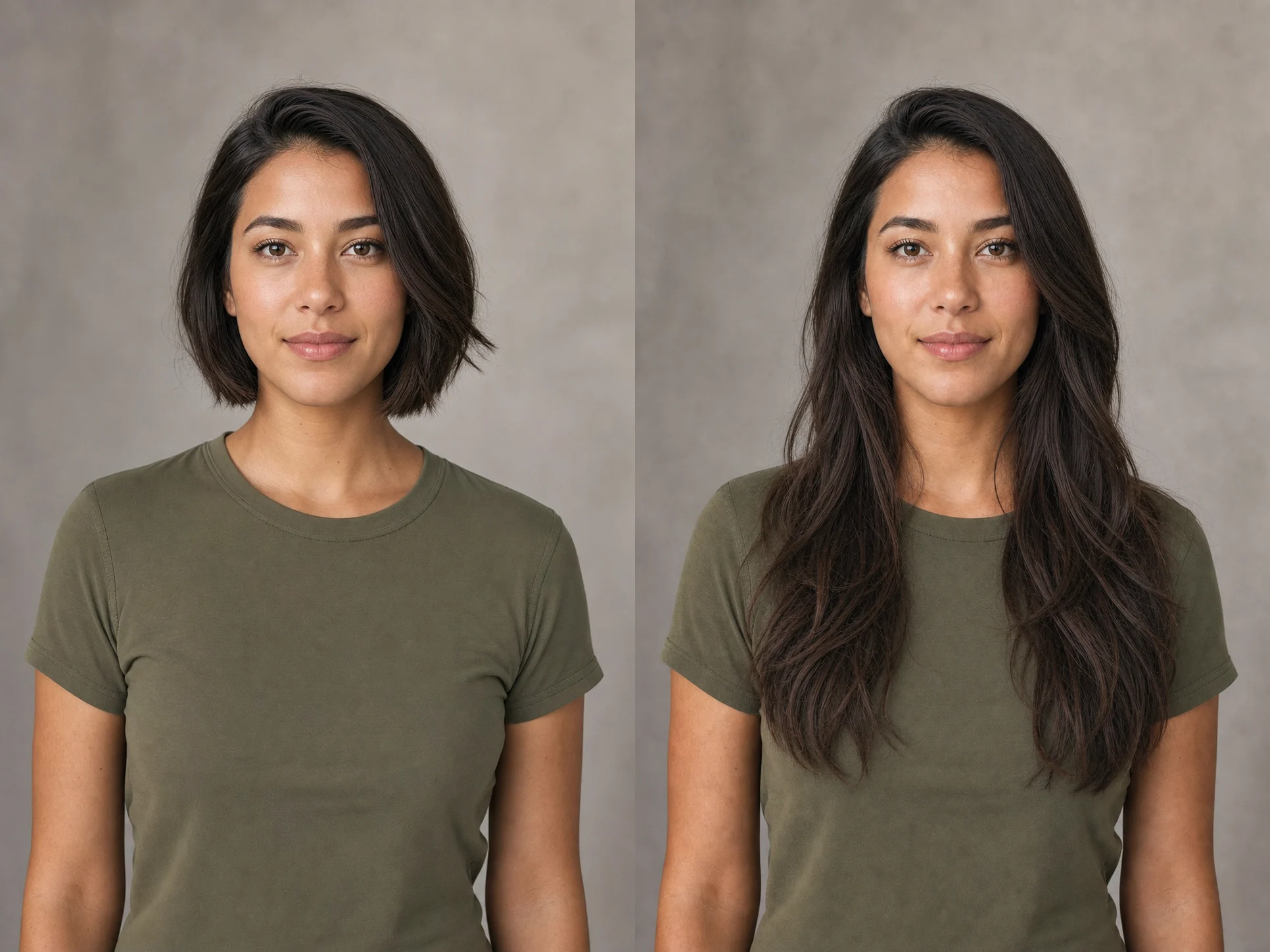
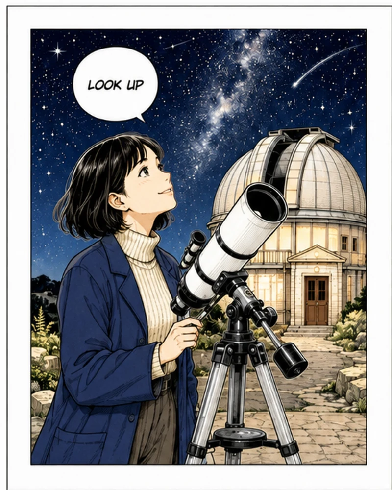
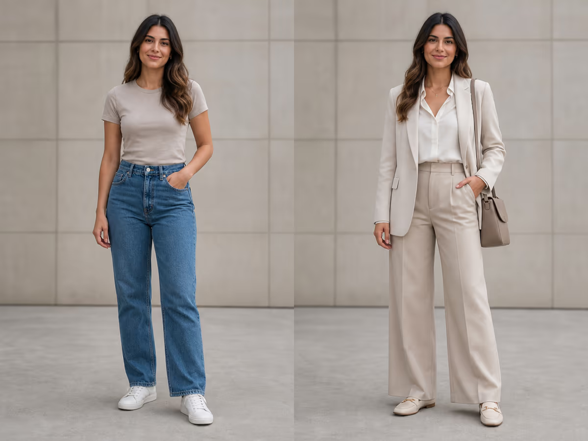
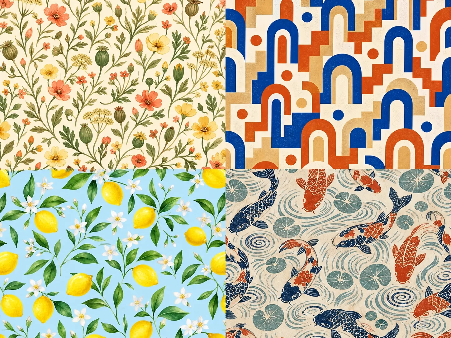
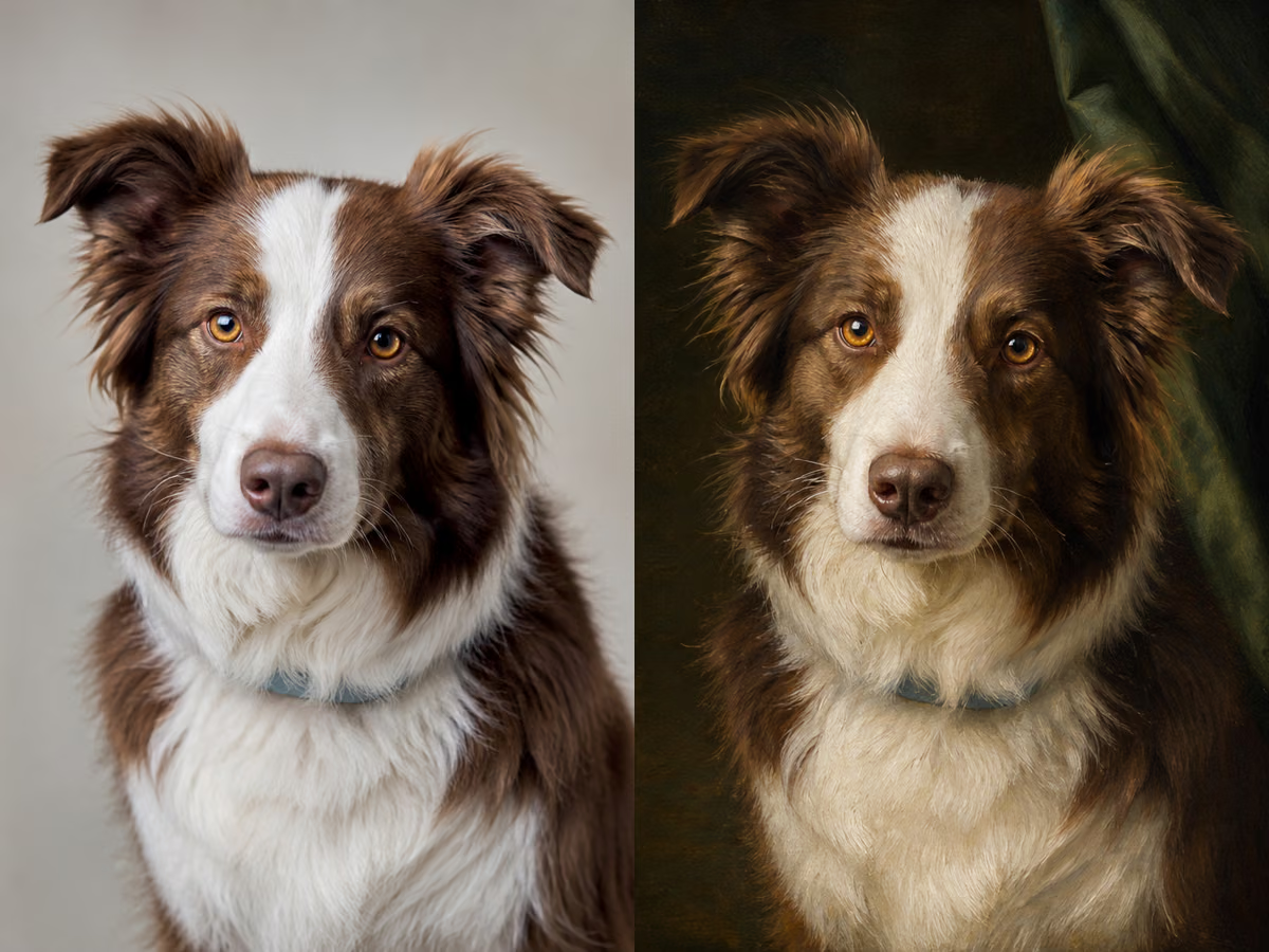
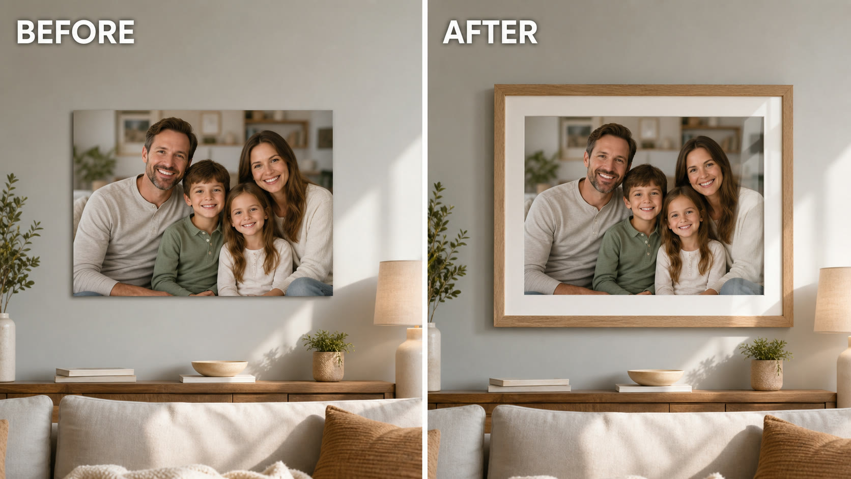
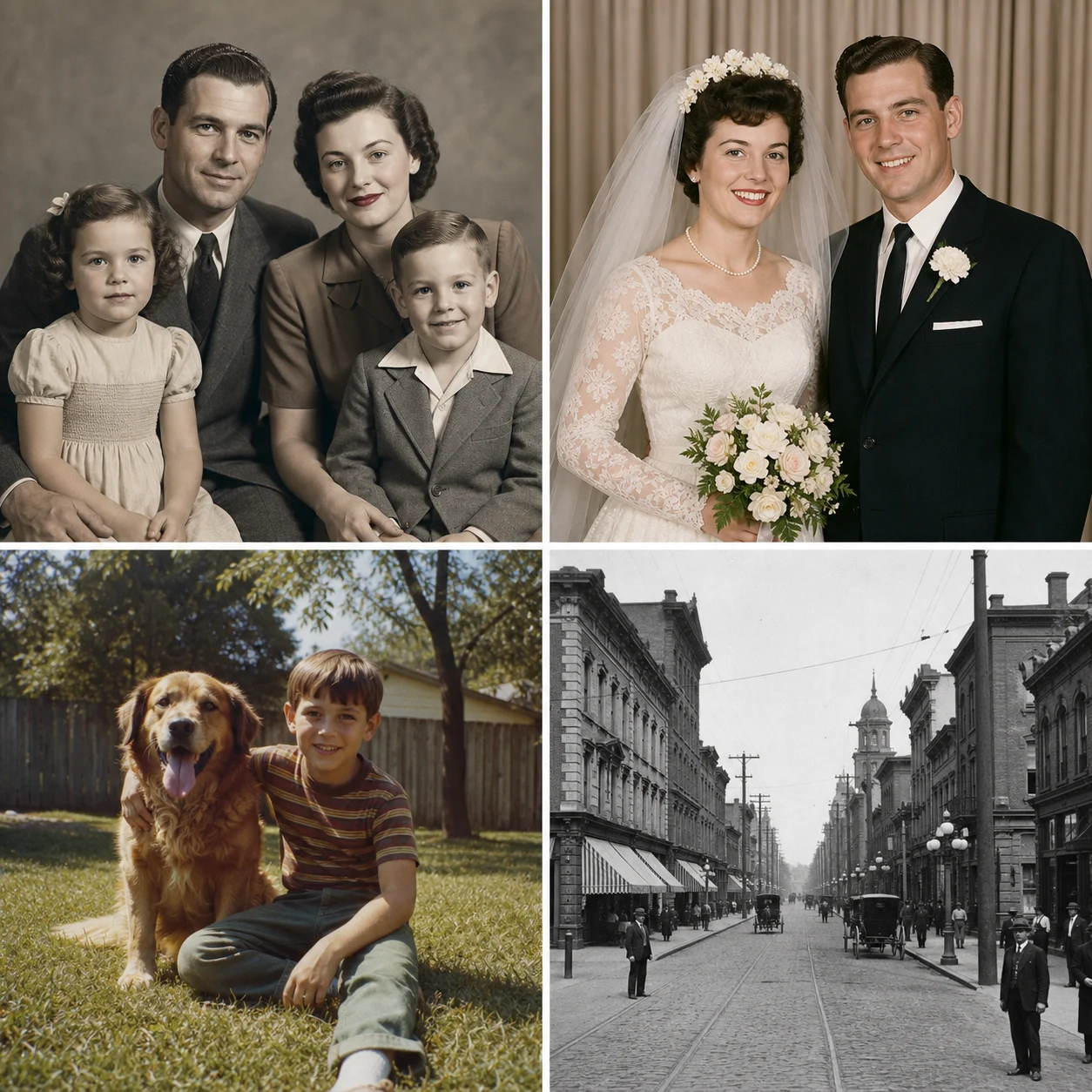
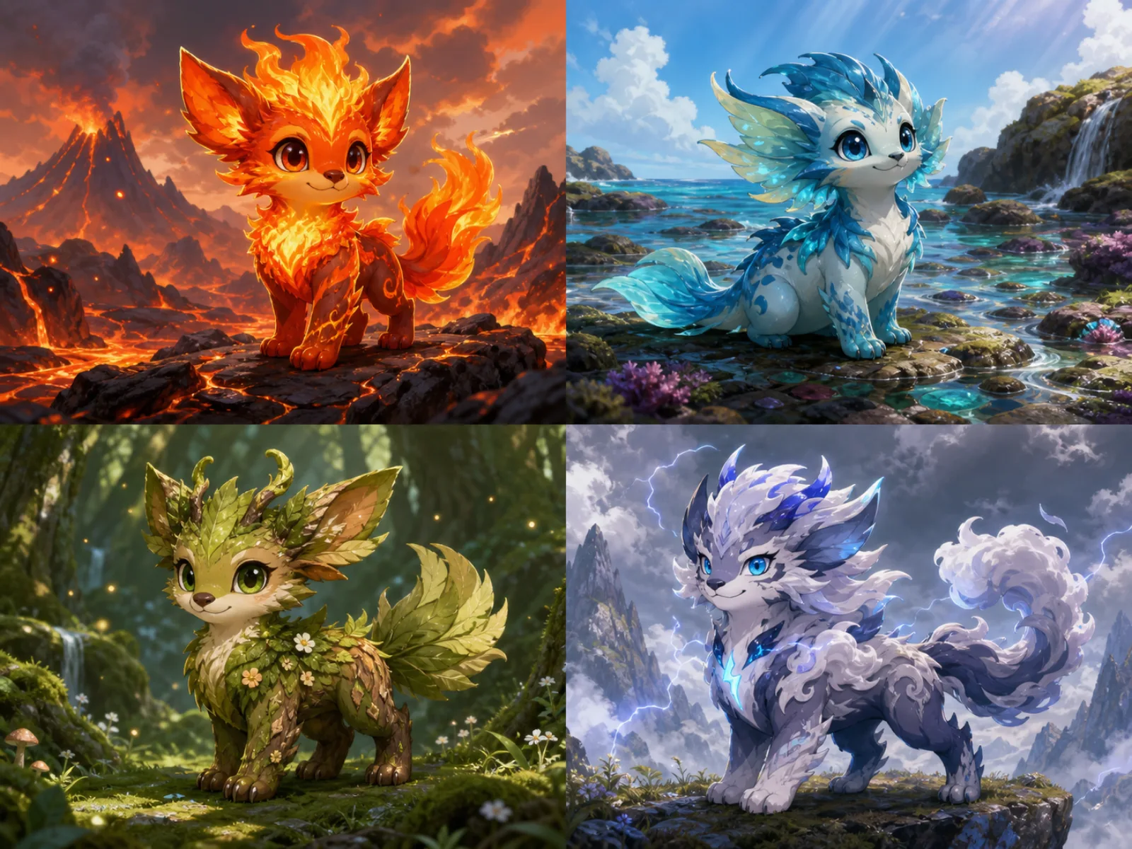
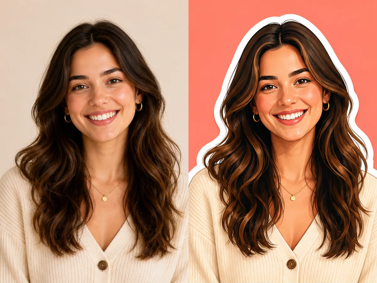
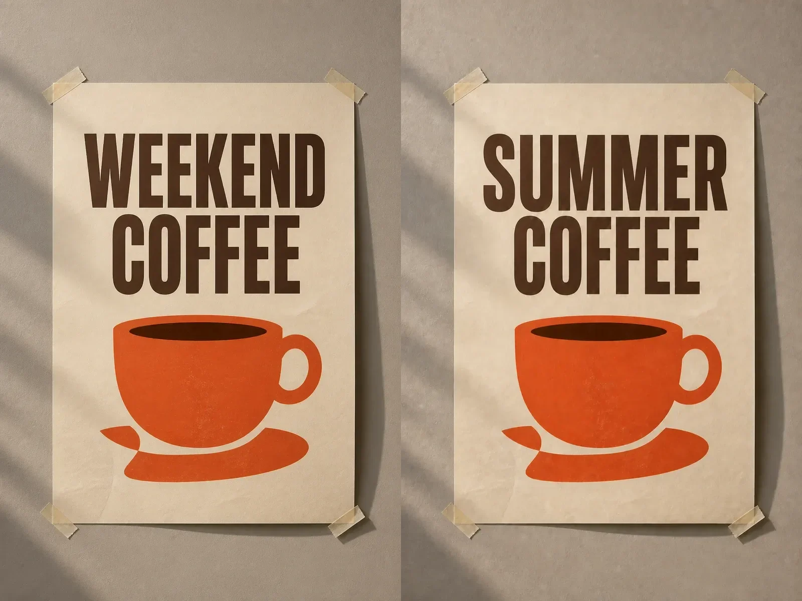
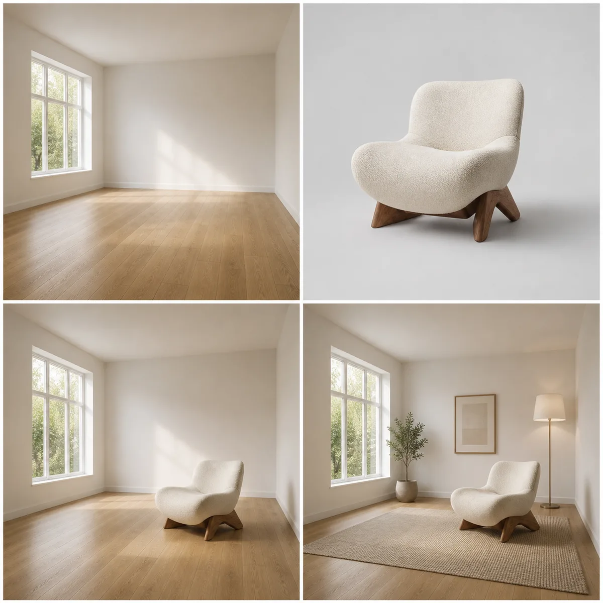
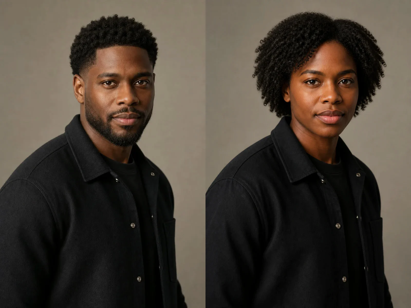
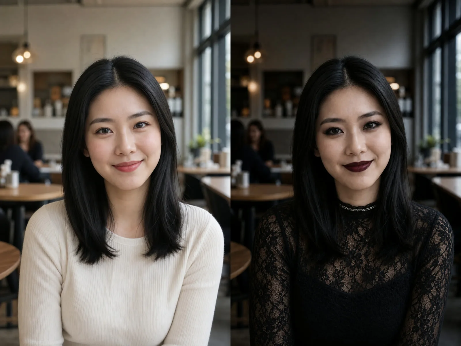
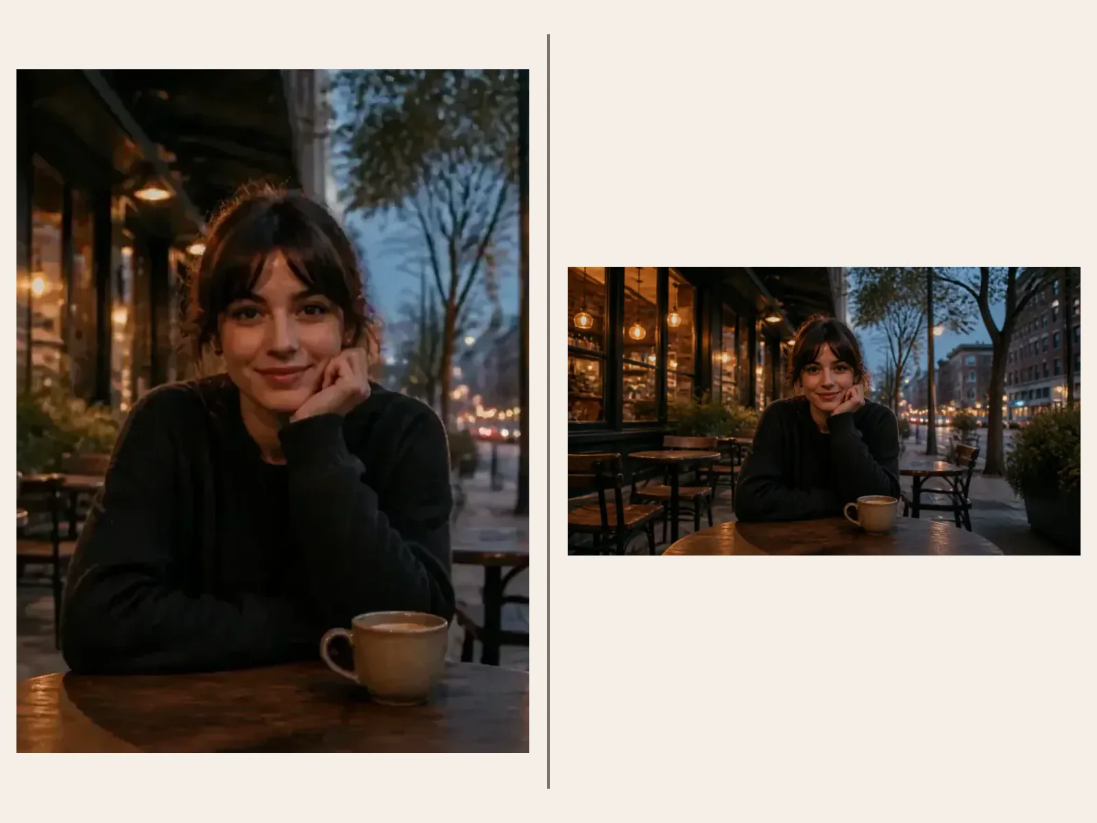
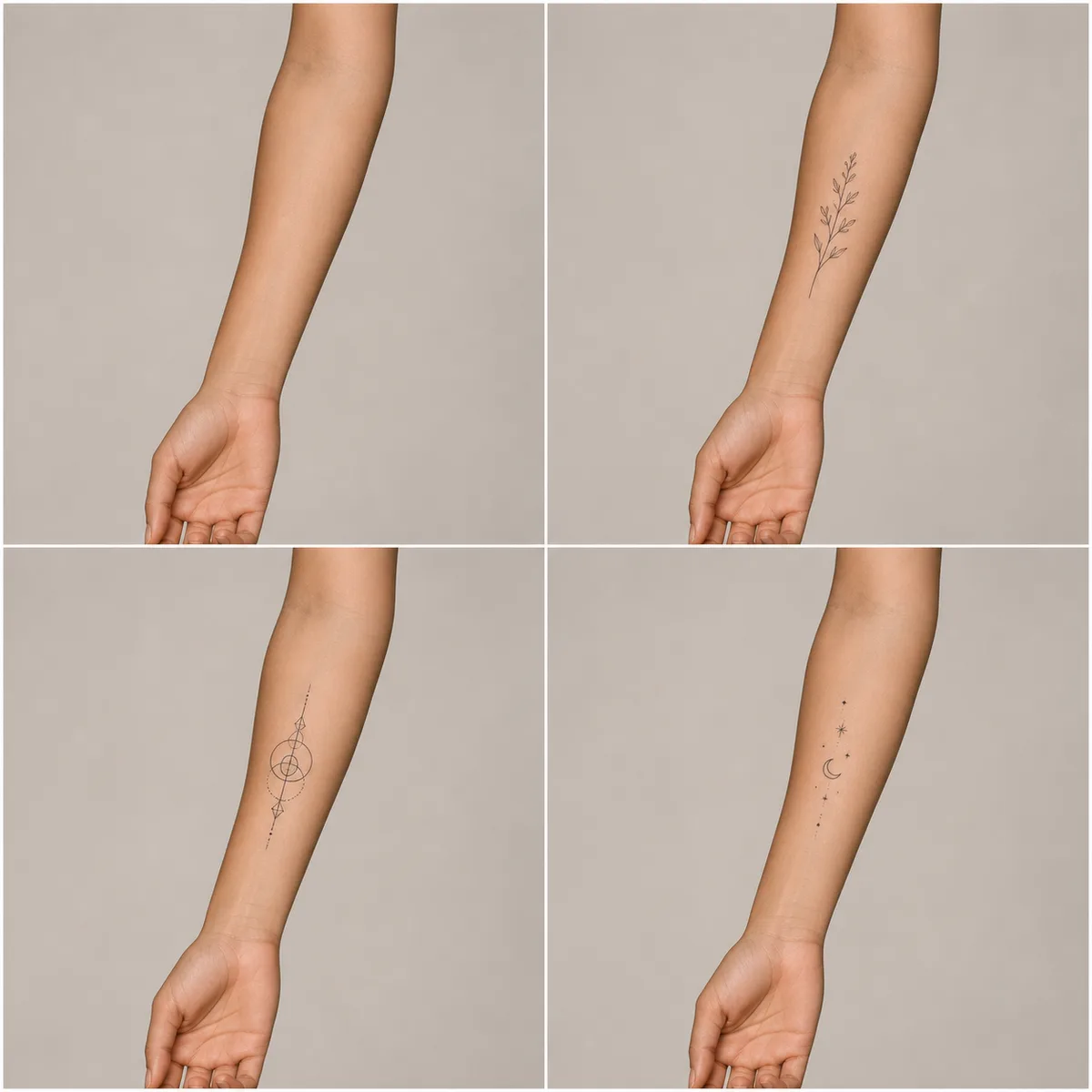
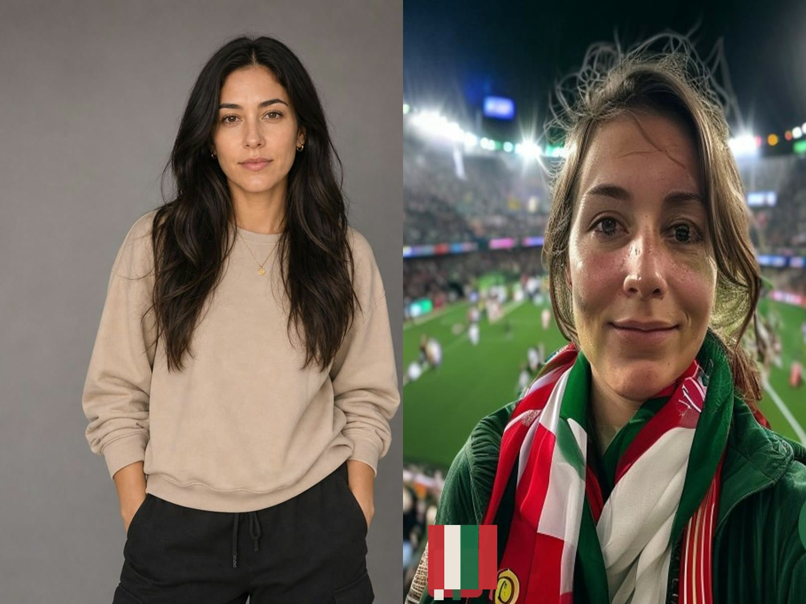
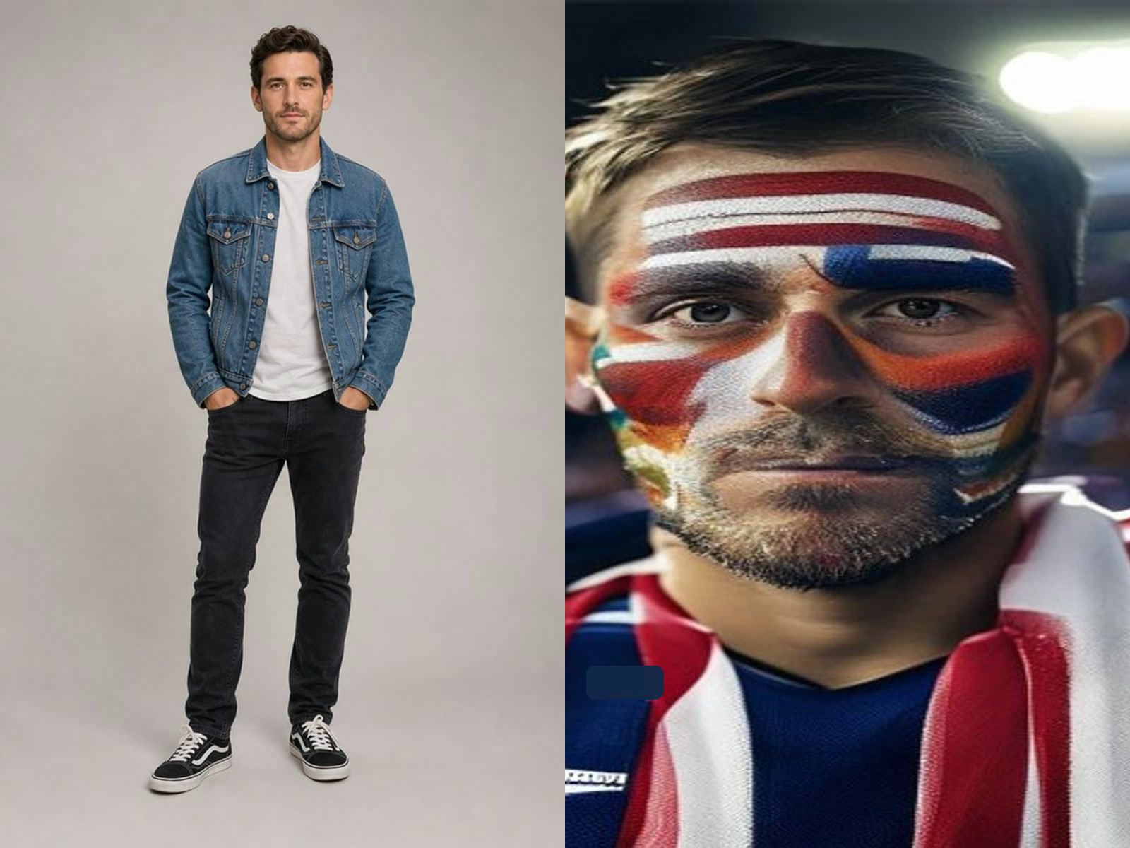
GPT Image 2.5 brings text-driven creation and reference-guided editing into the same model family. A written brief can describe a product photograph, illustrated scene, poster or presentation graphic. A reference image gives an editing request a starting point: name what should change, then identify the important details that should remain. The useful distinction is between creating a new composition and revising a composition you already have. Choose the mode that matches that intention before refining the prompt. Work from a clear purpose. A product image needs room for the product and honest visual details; a campaign poster needs readable hierarchy; an illustration needs consistent characters and composition. Describe those requirements directly instead of relying on strings of quality adjectives. Review the resulting image at its full size, particularly any text, small objects or details copied from a reference. A convincing thumbnail is only a first impression.
Flare and Sunburst: choose by the task
Flare and Sunburst are distinct variants of GPT Image 2.5. Flare is positioned for everyday creation and faster iteration, while Sunburst emphasizes detailed creative work and tighter editing control. Choose a variant deliberately when comparing a brief. Hold the prompt, references and canvas settings constant so the comparison tells you something about the result rather than about different instructions. Neither name guarantees a perfect image. For a complex campaign, first decide what counts as acceptable: a readable headline, the intended product shape, consistent lighting or a specific visual arrangement. Judge the output against those checks. If a simple draft already meets your needs, adding more complexity to the request may not improve the design. If a detail is wrong, revise that detail explicitly and check the surrounding image again.
Build prompts in five practical parts
Start with the purpose of the image and its audience. Next describe the main subject, including the materials, colors and relationships that matter. Specify the composition: camera position, space around the subject and where the viewer should look first. Add lighting or illustration style in concrete terms. Finish with exclusions and exact on-image wording. For a poster, write the headline in quotation marks and say where it belongs. Keep secondary copy short enough to review. For an ecommerce scene, describe the product as accurately as possible and avoid asking the model to invent specifications or certifications. For an illustrated explainer, list the required labels and their order. Image generation can still introduce spelling and factual errors, so inspect those details before using the result in public.
Edit from references without losing the brief
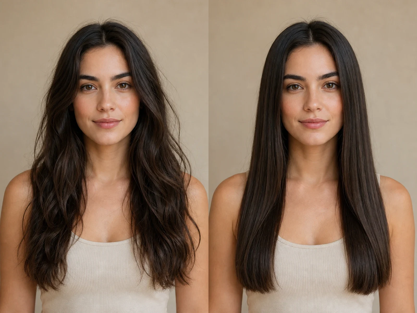
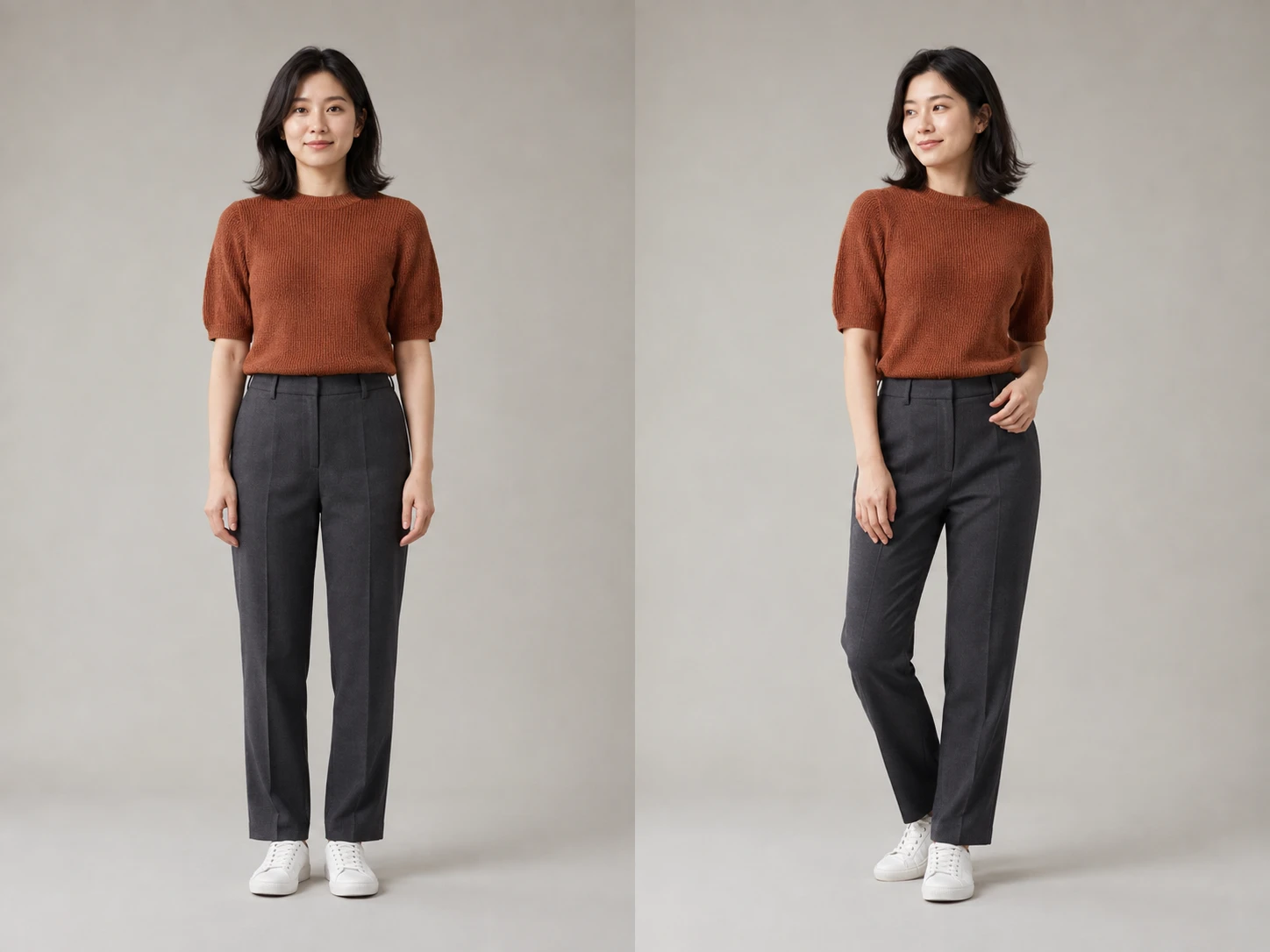
Use clear reference images that show the subject you want to retain. Explain the role of each image when you provide several: the first may define the product, another the palette, and another the composition. Conflicting references make your instructions harder to interpret. Prefer a small relevant set over extra images that add no useful information. For a focused edit, name one change and the surrounding details to preserve. For example: change the wall to muted sage green while retaining the sofa, camera position, floor and daylight. Compare both the edited area and the rest of the image with the input. If you continue editing, use the reviewed output as the next reference and restate the elements that still matter. This is a deliberate sequence of image requests, not a promise of an automatic conversation or perfect identity preservation.
Choose a canvas before finalizing the design
Select the aspect ratio for the intended placement. A square product card, portrait social graphic and landscape presentation have different space requirements. Put important text and faces away from the edges so the composition has room to breathe. Automatic ratio selection can help with a reference-led brief, while an explicit ratio makes repeated compositions easier to compare. GPT Image 2.5 supports 1K, 2K and 4K resolution selections. Four less common ratios—27:16, 16:27, 9:8 and 8:9—are restricted to 1K. A higher resolution does not repair incorrect wording, awkward anatomy or an inaccurate product. Resolve those problems in the brief and review the content before choosing the final output settings. Use the current controls as the source of truth for supported combinations.
Plan transparent backgrounds as part of the prompt
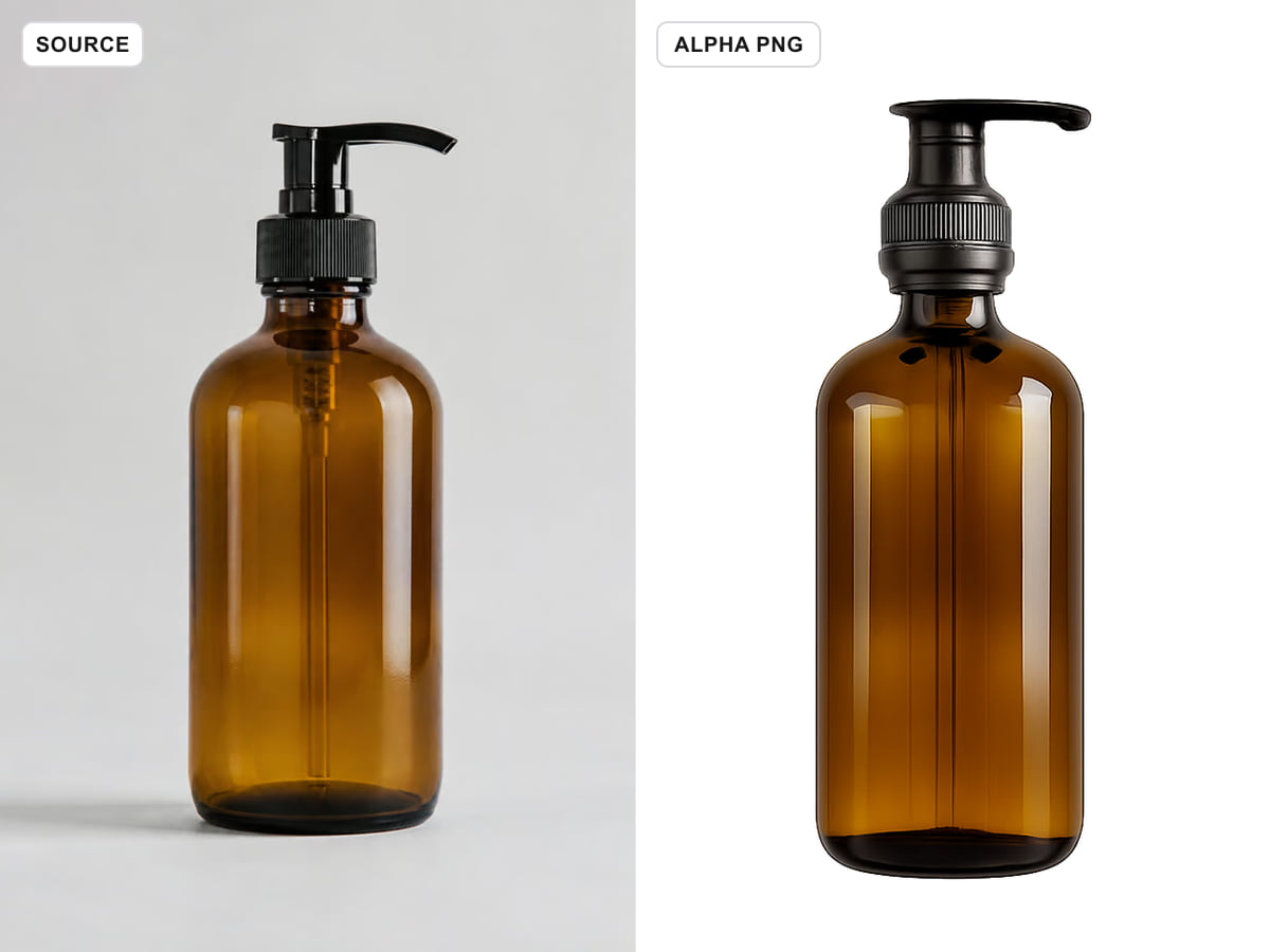
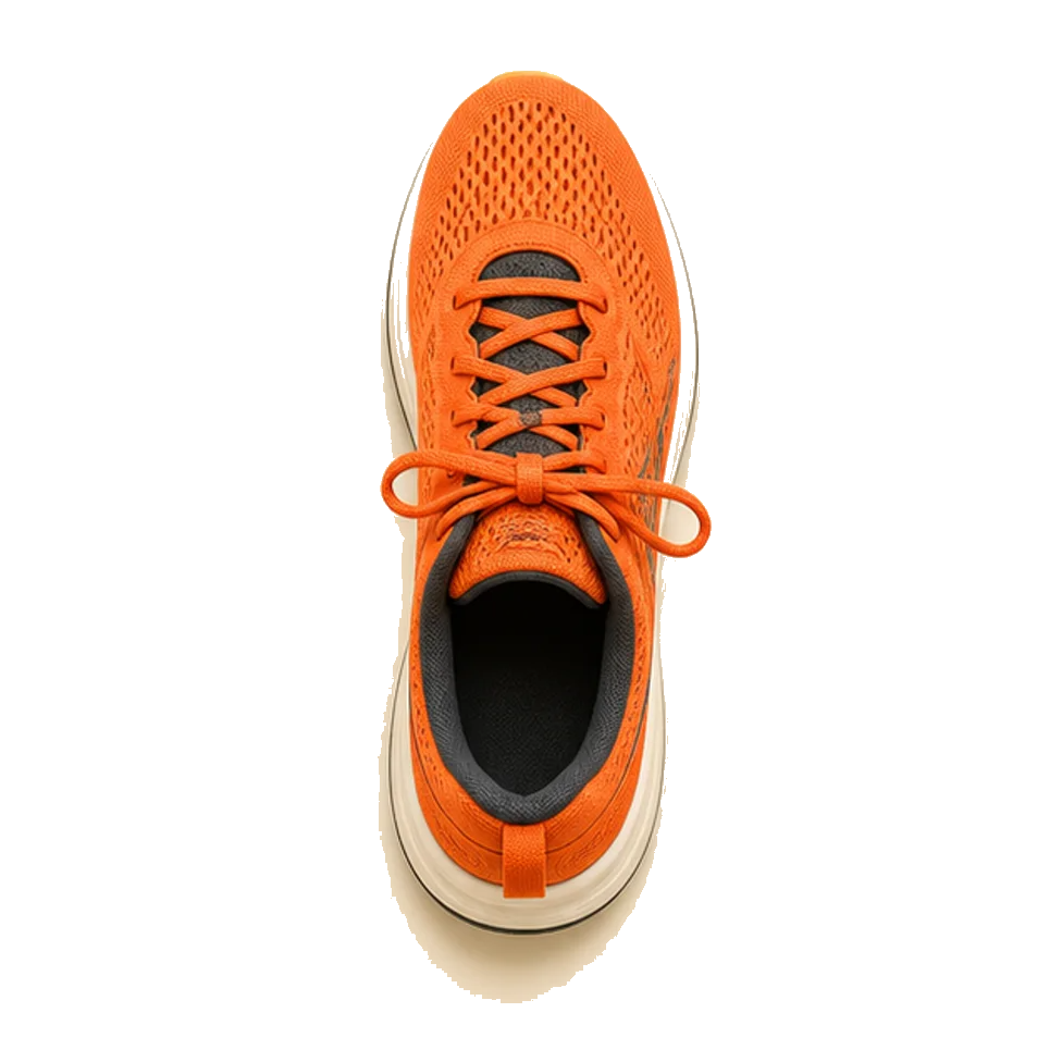
For an isolated object, ask for a transparent background and describe the object without a backdrop, scenery or cast shadow. When editing a reference, explicitly ask to extract the subject and retain transparency. Check the downloaded file in software that shows transparency; a white-looking preview alone does not establish that the background is transparent. Fine hair, translucent materials and soft edges deserve close inspection.
Start with a deliverable, not just a style
Decide where the image will be used before writing a prompt. A presentation cover needs a clear focal point and room for a heading. A product listing needs an unobstructed view of the item. A social announcement needs a composition that remains understandable on a small screen. These are different briefs even when all three use the same colors. Describe the intended placement so you can judge whether the composition works for it. Separate requirements from preferences. The correct product color, a legible event date and space for a logo may be requirements. A particular mood or texture may be a preference. Put the requirements first and keep a short review list beside the prompt. If a result looks attractive but fails a requirement, treat it as a draft. For precise layouts, it can be more practical to generate the visual background and finish typography in a design editor.
Useful briefs for teams and individual creators
For a small shop, a brief might describe a tabletop scene around a supplied product photograph. Name the product features that must stay recognizable and the props that may change. Do not let a generated scene imply accessories, ingredients or performance characteristics that the product does not have. Compare the output with the source photograph before using it in a listing. For an educator, an illustration can introduce an idea or give a lesson a visual theme. Keep explanatory labels short and check the relationships between objects. When a diagram must communicate exact quantities, measurements or scientific structure, construct or verify those elements separately. A plausible-looking illustration is not a validated diagram. For a creative team, use a draft to discuss composition, palette and emphasis. Record the prompt and reference roles alongside the selected draft so the next person understands the intent. This makes feedback specific: move the subject away from the headline area, reduce background clutter, or preserve the reference object's proportions. Avoid judging a concept only by how polished it looks.
Prepare reference images with a clear purpose
Choose references that are relevant to the requested change. A sharp image with an unobstructed subject gives you a better basis for describing what should remain than a collage with several competing subjects. If the reference includes text that must stay exact, transcribe it into your instructions and check it afterward. If a background is irrelevant, explain whether it should be replaced, simplified or retained. When using several images, identify each by its position and role. For example, ask to retain the object from the first reference and use only the color palette from the second. That wording does not guarantee perfect separation, so inspect the result for unwanted details borrowed from another reference. Avoid including personal information that the image task does not need. Use material you have permission to upload and adapt. Keep your original files. A generated edit is a new output to review, not a substitute for the original source. Compare edges, logos, small repeated elements and the shape of the main subject. A correct background change can still be accompanied by an unwanted change elsewhere.
Know when a different workflow is a better fit
Image generation is not the right final step for every task. Use a conventional layout editor when every letter, margin and alignment must match a specification. Use a dedicated measurement or technical drawing workflow when dimensions need to be exact. Use original photography when you need documentary evidence of a product, place or event. A generated interpretation cannot establish that something really existed or happened. For a narrow correction, compare the effort of a generated edit with a simple crop, mask or color adjustment. A direct edit may be easier to control when the change is small. For a broad creative revision, a reference-guided generation may be useful, but you should still review the entire frame. This page does not promise pixel-perfect preservation, automatic brand consistency or guaranteed factual correctness.
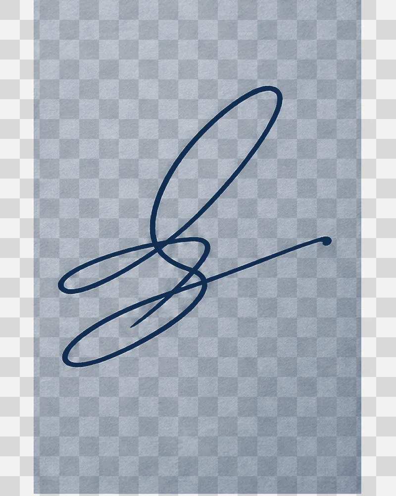
Review transparency, edges and final placement
A transparent background is useful only if the subject remains clean at the edge. Inspect the output over both a light and a dark background in an editor that displays transparency. Look for pale outlines, missing fine details and areas that should be translucent rather than fully opaque. A checkerboard pattern drawn into an image is not the same as a transparent file. Place the reviewed image into the actual layout before calling it finished. Check whether text remains readable at the intended display size and whether the subject has enough separation from the surrounding design. For a printed deliverable, check the final dimensions and print requirements in your layout software. A resolution label alone does not establish that an image meets a printer's requirements. Keep a copy of the accepted output and the brief used to make it. If you later request another version, compare it with that accepted copy. Do not assume a repeated prompt will produce an identical composition or preserve every detail.
Use a short review loop
Make one focused change at a time when a draft is close to the intended result. Describe the change in plain language, repeat the elements that should stay, and inspect the next output against the same checklist. If several parts are wrong, simplify the brief before adding more instructions. Contradictory requirements make it harder to identify what the next request should achieve. Keep notes on why you accepted or rejected a draft. “The headline is misspelled” is more useful than “the image is bad.” “The product is too small for a mobile card” identifies a composition issue that can be addressed directly. Once the essential requirements are met, move to final layout and verification rather than treating endless variations as proof of improvement.
Questions before you generate
Is GPT Image 2.5 the same as GPT Image 2?
No. Flare and Sunburst belong to the separate GPT Image 2.5 model family. Review the selected model before submitting.
Can I edit an existing image?
Image-to-image editing accepts reference images. Give a specific edit instruction and review any unintended changes. Supported upload limits must be shown in the generator.
Does this page include ChatGPT Sketch or image comments?
This page is designed for prompt-and-reference generation. ChatGPT Sketch and image comments are separate product features.
Are the images guaranteed to be accurate?
No. Check spelling, subject details, factual content and suitability for the intended use. A polished style does not establish accuracy.
What access is available on NanoPic?
Choose GPT Image 2.5 Flare or Sunburst in the generator. Text to Image starts from a written brief, while Image to Image requires at least one uploaded reference. The live controls show the current resolution-dependent credit cost before submission.
Can I use the same prompt for different placements?
You can reuse the core subject description, but review the composition for each placement. A landscape banner and a portrait card need different spacing. Specify which elements must remain visible and where text will be added. After changing the ratio, inspect the whole result again rather than assuming it is a simple crop of the previous composition.
How should I ask for exact wording inside an image?
Quote the required wording and describe its location and hierarchy. Avoid asking for long paragraphs in a small area. Check every character after generation, including dates and punctuation. If exact typography is essential, finish the text in a layout editor where you can directly control spelling, font and alignment.
What should I compare when reviewing an edited reference?
Check the requested change first, then inspect the parts you wanted to preserve. Compare the subject outline, product details, faces when relevant, text and background objects. Look at both the full composition and a closer view. Keep the original reference available so you can identify changes that are easy to miss from memory.
Can I test Flare and Sunburst on NanoPic now?
Use the generator above to choose Flare or Sunburst, select Text to Image or Image to Image, and review the live credit cost. Image editing accepts reference uploads; generated results should still be checked at full resolution before use.