









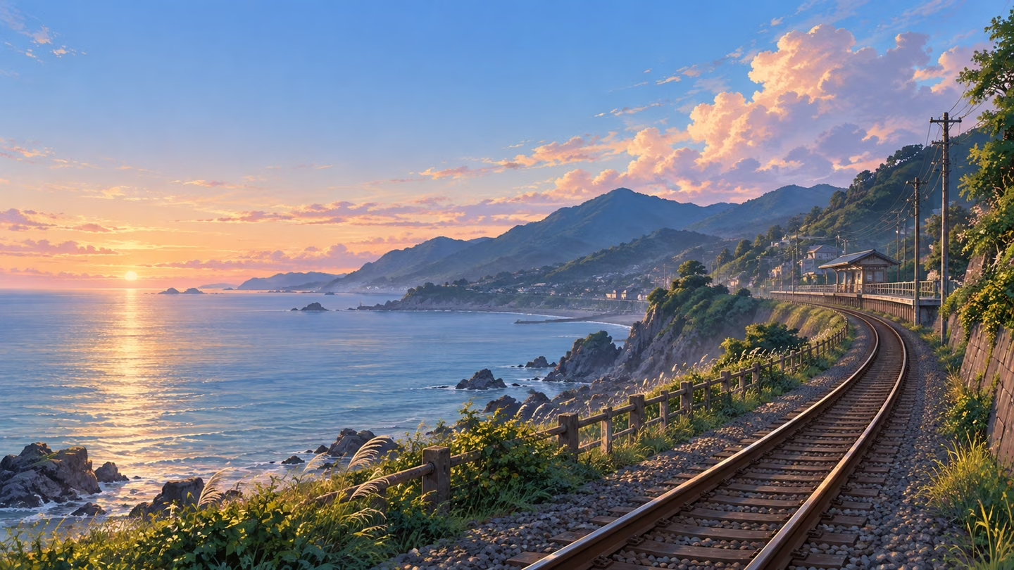
Seaside railway at dawn
A curved railway leads into distant coastal hills, with quiet sky above. Try describing your own setting, viewpoint and time of day.
Save up to 73% on plans
Image
Browse every other AI image model and effect published on this site in a continuous carousel.
Original AI-created scene example; illustrative artwork, not a verified output from this page’s model.
A curved railway leads into distant coastal hills, with quiet sky above. Try describing your own setting, viewpoint and time of day.
Start with a setting, viewpoint and time of day. A low viewpoint beside a seaside railway produces a different scene from a hilltop looking over the coast. Add weather and a limited color palette, then say whether the space should feel quiet, lively or mysterious. The editable brief above begins with a complete scene you can change.
Use 16:9 for a desktop background or wide story setting, 9:16 for a phone background and 1:1 for a square scene. Aspect ratio controls composition, not a promised pixel resolution. Check the downloaded dimensions before using the picture in a final layout. Keep important details away from edges that a device may crop.
Ask for a quiet area where icons, a clock or your own title will sit. Specify its position: open sky in the upper left, a softly shaded wall on the right, or uncluttered water along the bottom. Add your final lettering separately so spelling and placement remain under your control.
Inspect rails, paths, windows and repeated objects for inconsistent perspective. Foreground shapes should lead into a readable middle ground and distant background. If the scene is too busy, simplify the brief before adding more detail. Save a result before trying a new variation; another generation creates a new image.
Sign in when prompted, review the credit amount displayed by the generator and start one request. Wait for the completed result, open the image to inspect it and use its download control. The generation history tab lets you revisit account tasks. Each additional generation uses the amount shown at that time.
For a desktop wallpaper, start with a wide view and decide which side holds your folders or application shortcuts. A detailed station, cottage or grove can sit on the opposite side while sky or distant water provides a calmer area. Avoid placing a bright highlight directly behind small white labels. After downloading, try the image on your actual screen and check how your operating system scales it. If the crop removes an important detail, change the composition or choose a different image rather than stretching the original.
A portrait background needs a different arrangement from a wide landscape. Describe a path, tree or building that leads upward, then reserve a simple area around the clock. Keep the main subject away from the top edge and from interface controls near the bottom. The 9:16 option is a starting shape, not a device-specific wallpaper preset. Preview the result on your phone before sharing it, and remember that lock screens and home screens can apply different crops or zoom levels.
When preparing scenery for a story or presentation, keep a short written brief containing the season, time of day, palette and viewpoint. Reuse that brief when you request another location, changing only the elements that need to vary. This can guide a related visual direction, but separate generations may still differ in architecture, lighting or fine details. This tool does not create layered backgrounds, editable 3D scenes or a guaranteed continuous environment. Keep the finished images you like and compare them together before choosing a set.
If a first result feels wrong, identify a concrete issue before rewriting the prompt. For an overcrowded frame, reduce the number of objects. For weak depth, describe a foreground shape, a middle-distance subject and a distant horizon. For an overly dark wallpaper, ask for softer shadows and a lighter quiet area. Change one or two decisions at a time so you can see their effect. Review repeating structures and edges at full size; a convincing thumbnail can still contain small visual mistakes.
A visual novel background has to support characters and dialogue, not compete with them. Decide where character sprites will stand before describing the environment. Put the main architectural feature slightly off center, keep the lower dialogue area simple, and avoid a strong vertical edge directly behind a character's face. For an interior, name the room's function and a few useful props rather than requesting every object imaginable. A school reading room might need shelves, a window and an open aisle; it does not need a crowd. Generate the empty setting first and add your own sprites and dialogue in your editing or game software. This page exports an image, not a layered scene or a ready-to-import game project.
For a creator or VTuber backdrop, design around the avatar, camera frame and stream overlays you already use. Describe an empty desk corner, studio window or fictional rooftop, and specify a clear area where the avatar will appear. Keep busy shelving and bright signs away from chat panels and small status labels. A quiet background can still have character through a limited palette, a distinctive lamp or a distant skyline. Test the downloaded image inside your broadcasting layout at the resolution viewers actually see. Check that your avatar remains readable during movement. The result is a still background: animated lighting, transparent scene layers, camera tracking and stream overlays need separate tools.
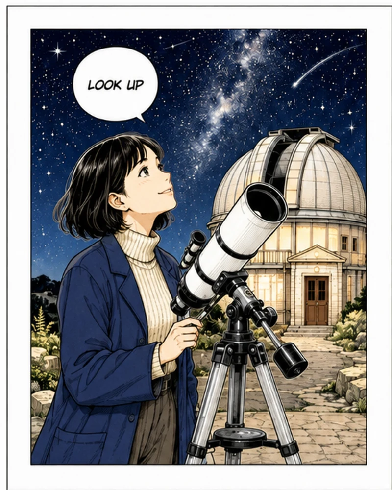
A useful scene prompt identifies a place, a viewpoint, the light, the visual treatment and the space to leave clear. For example: an original hilltop observatory garden; eye-level view along a curved path; cool blue evening with warm window light; softly painted animation scenery; an uncluttered area above the horizon. Each phrase answers a different design question. Add only details you want to inspect in the result. Long lists of unrelated styles can weaken the scene's direction. If you need an empty environment, say no people or foreground characters. Keep final titles, logos and readable signs out of the request and place your own approved text in an editor after downloading.
The horizon helps a scene feel like a place a viewer could occupy. An eye-level street view, a low camera beside a railway and a high view over rooftops imply different relationships between the foreground and the distance. Pick one viewpoint and describe it plainly. After generation, trace a few long edges such as rails, rooflines or corridor walls. They should recede in a reasonably consistent direction. Look for windows that change size unexpectedly, stairs that stop without a landing and objects that seem to float. If several structures conflict, simplify the architecture or ask for fewer repeated elements. Extra texture rarely solves a composition whose basic perspective is unclear.
Choose a small palette with a clear light source. A cool seaside scene with peach dawn clouds will feel different from a green courtyard under flat overcast light, even if both contain a path and distant buildings. Name the dominant colors and reserve one warmer or brighter accent for the area that should attract attention. For a background behind subtitles or icons, avoid fine high-contrast patterns in the reading area. Inspect both a small thumbnail and a larger view: the thumbnail reveals the broad light-dark balance, while the larger view reveals distracting edges. If the image feels noisy, reduce competing accents before asking for additional detail or stronger saturation.
For a small set of story backgrounds, write down the details that should remain stable: architectural era, materials, season, palette and camera height. Then create a separate short variation for the scene that changes, such as rain outside the station or evening in the courtyard. Compare results side by side before treating them as one location. A text brief can suggest continuity, but it does not lock a building's exact floor plan or preserve every object between requests. This page has no reference upload or scene-lock control. If precise continuity matters, keep one accepted image as your editing base in another workflow, or use a dedicated scene design process with manual review.
A wide monitor, a laptop and a phone may crop the same picture differently. Select a ratio that matches the intended orientation, then test the downloaded file in the actual wallpaper settings. Check the clock, dock, widgets and notification areas, not only the central subject. A composition that works on an empty preview may become crowded once these controls appear. Keep an untouched copy before making a device-specific crop in an editor. If you need a different orientation, compose a new scene for that shape rather than forcing a wide railway into a narrow frame. The ratio selector shapes the request; it does not guarantee a particular pixel count or perfect device fit.
Open a completed image at a useful viewing size before downloading a final selection. Check repeated architecture, plant edges, reflections, distant objects and any unexpected marks that resemble lettering. Decide whether the image meets the original brief: is the required quiet space actually clear, and is the intended focal point visible? If a small flaw is easy to repair, you may prefer a separate editor to another generation. If the overall layout is wrong, revise the brief instead. Keep notes about the prompt and selected ratio alongside useful downloads. Generation history can help you revisit account tasks, but a downloaded copy is the practical file to keep with your project assets.
After choosing a scene, make the final crop, color adjustment and typography in an image editor you control. Preserve the source file and export a separate version for each destination. Add your own character sprites, branding or titles on separate layers where your editor supports them. Inspect fine lines again after resizing because a detailed background can lose clarity at a small display size. For a stream layout, test the exported image behind the real overlays. For a visual novel, test it with dialogue visible. This generator does not supply transparent layers, automatic text placement, animation or a guaranteed print-ready file; those finishing decisions remain part of your project workflow.
Build an original brief from qualities such as coastal geography, soft painted edges, warm window light or a quiet nighttime palette. Avoid requesting a duplicate of a recognizable film frame, franchise location, logo or another creator's finished artwork. A broader description gives you room to develop a scene suited to your own story instead of copying someone else's composition. Before publishing, inspect the output for unexpected familiar symbols or branding and review the applicable service terms for your intended use. AI generation alone does not establish exclusive ownership or clear every possible third-party right. For work that needs formal rights clearance, include the image in your normal review process and seek appropriate advice when needed.
No. This page starts with text. To transform an existing photo, use Photo to Anime instead.
Choose 9:16 and specify space for the clock. Check the downloaded dimensions and your device crop; a precise device fit is not guaranteed.
Original AI-created scene example; illustrative artwork, not a verified output from this page’s model. Your completed generations appear in the result panel.
Review the live credit quote before generating. Availability and account credits determine whether you can start; this page does not promise unlimited free generation.
Review the applicable service terms and the image itself for your intended use. Do not assume exclusive rights or that every generated detail is cleared for commercial use.